Stability
To do this, first select your active environment at the top right. All environments to which you have access are available.
Using the magnifying glass icon at the top, a global search function is available.
Overview

At the very top, you will see a summary of all installed and abnormal apps as well as the average app crashes and hangs per endpoint in the time period you selected (selection directly below, on the right in the Measurement area). The average app crashes and hangs are compared to the global average, i.e. the average app crashes and hangs of all environments captured in baramundi Proactive Hub. The trend is shown with the small number (see tooltip).
Measurement
In the Measurement section, you can see all prominent apps in your selected environment listed in the selected time period, sorted by number of recent app crashes by default. Here you'll find an explanation of the table functions.
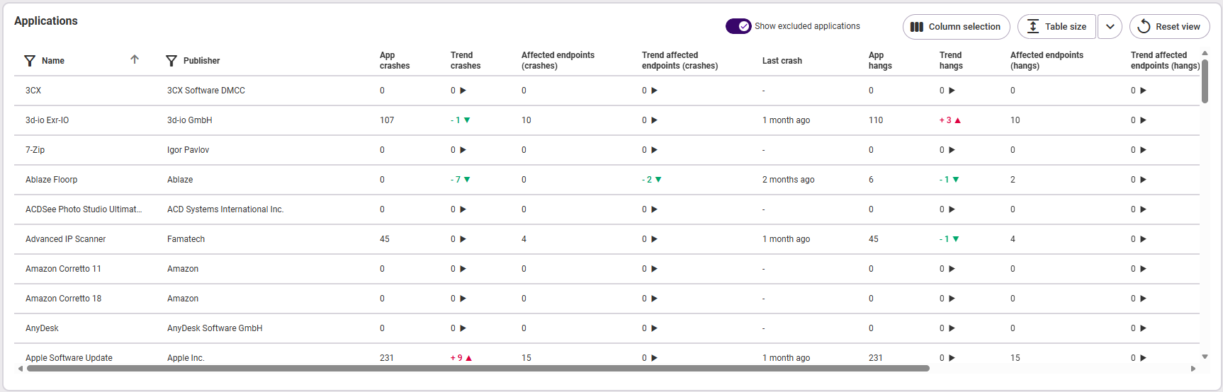
The following information is available:
- App name
- Publisher
- Number of app crashes
- Trend (the change compared to the past period)
- Number of endpoints affected by an app crash
- Trend (the change compared to the past period)
- Time of the last app crash
- Number of app hangs
- Trend (the change compared to the past period)
- Number of endpoints affected by an app hang
- Trend (the change compared to the past period)
- Time of the last app hang
Analysis
The Analysis pane splits into three graphs:
At the very top, you will see a summary for app crashes or app hangs, depending on which category you choose on the left (fig. from left to right):

- How many endpoints are affected by all in the selected environment?
- How many app crashes or hangs were there in total and what is the trend (small number)?
- How many app crashes or hangs were there on average per endpoint and how does this compare to the global average of all endpoints listed in baramundi Proactive Hub (trend in the small number)?
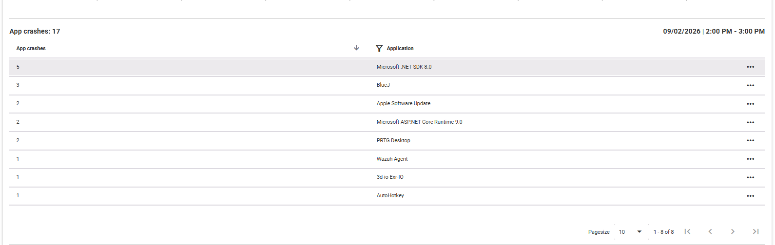
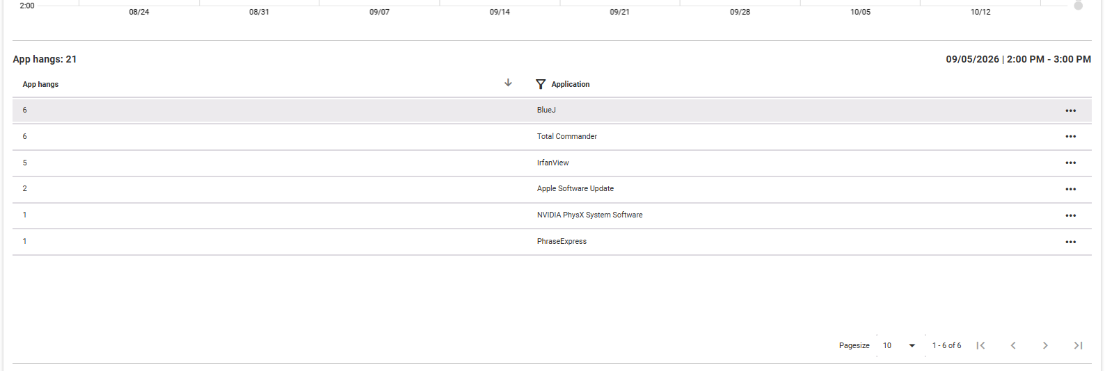
Below that is the overview of both app hangs and crashes. By clicking on a point in time in the graph on the left, you can see the applications affected on that day in the associated table on the right, with the number of endpoints affected and the number of app hangs and/or crashes that occurred. Use the three-dot menu on the right of each application to open it in detail view in a new tab.
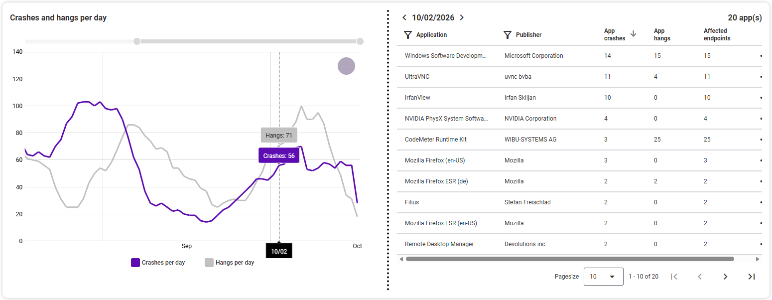
In the two graphs below, you can see the worst 10 crashes (or hangs, depending on the selected category) per application on the left, and the crashes (or hangs) per hour on the right.
Note: In the graphs at the top left and bottom right of the analysis area, select the time period by using the mouse wheel (zoom in/out) or the zoom bars at the top (and right). The period of Worst 10 applications can be set separately from the period otherwise selected.
Crashes and hangs
Crashes/hangs per application
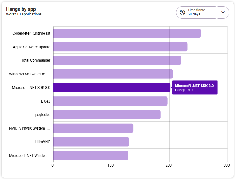
The left graph shows you the worst 10 crashes/hangs per application. The vertical axis shows the names of the affected applications, and the horizontal axis shows the number of crashes/hangs. Clicking on an endpoint opens the detail view for that endpoint.

Criticality of specific crashes (app crashes only)
This diagram shows the ten most frequently occurring error codes (y-axis), based on the selected time period on the right. It displays the app crashes, the affected endpoints, and the affected applications. This gives you a quick overview of which error code leads to the most frequent app crashes and how many devices and applications were affected. In addition to setting the time period, you can sort by app crashes (default), affected endpoints and affected applications in the diagram. The most frequently occurring number is always at the top. The x-axis is divided into two: The app crashes are shown on the left, the affected endpoints and applications on the right.
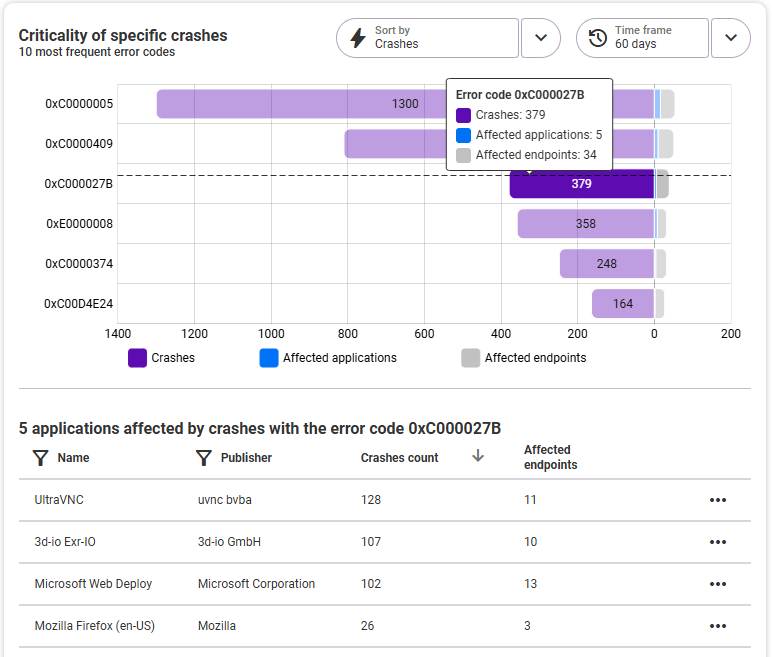
In the list below the diagram, you can see the affected applications based on the error code selected above (line in the diagram). At a glance, you can see the application, the publisher, the number of app crashes on this device, and the number of affected endpoints. The table columns can be sorted in ascending or descending order; the free text filter is available for the Name and Publisher columns. To view the details for an application, click on the corresponding line or open the application using the three dots on the right. On the application details page, the Measurement area is then already pre-filtered according to the selected error code.
Crashes/Hangs per Hour
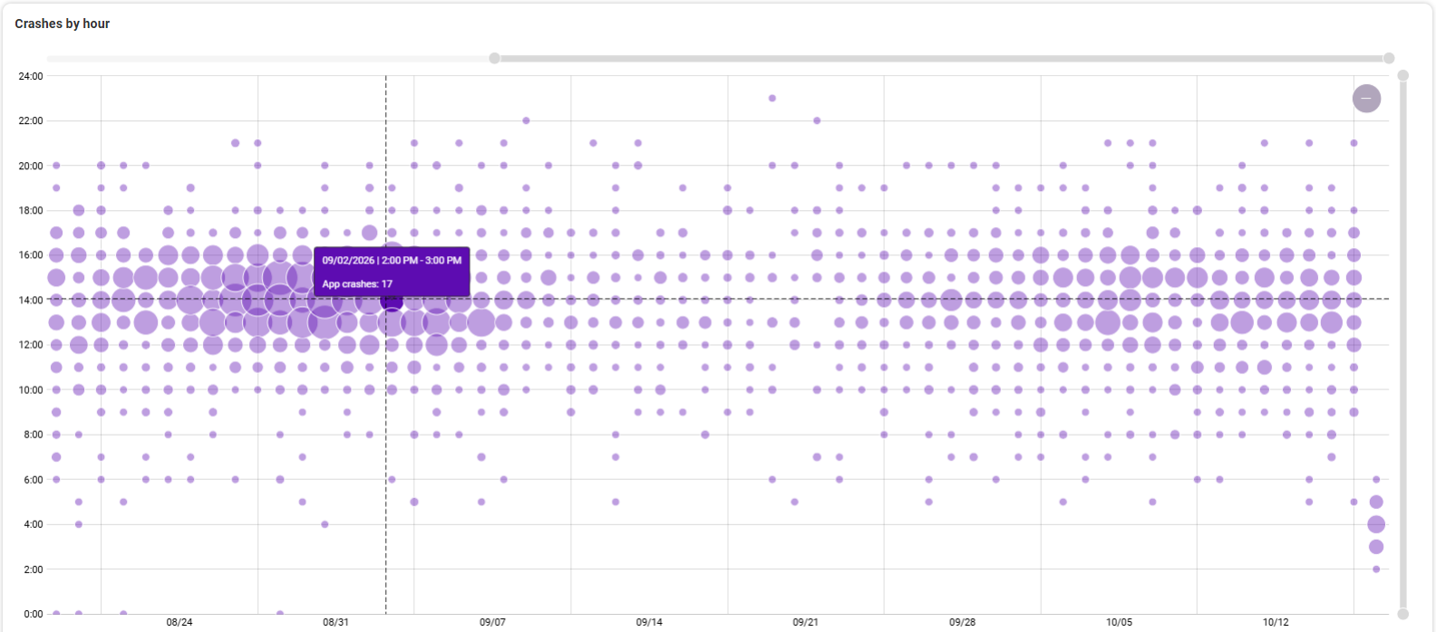
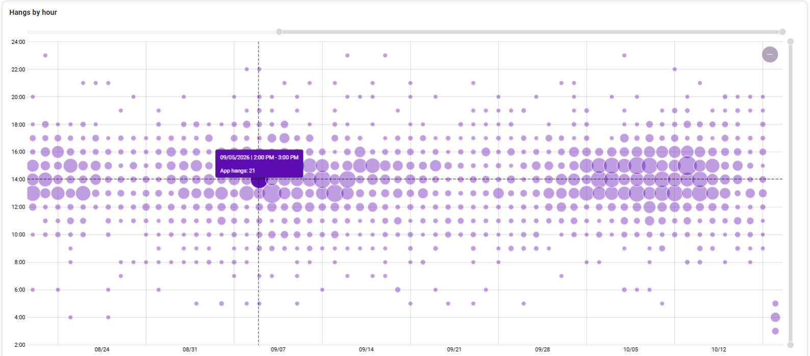
The right graph shows you the crashes/hangs per app and per hour. The vertical axis shows the time in hours, the horizontal axis shows the selected time period. Move the mouse over a circle, you will see details. Clicking on a circle opens a list of affected apps below the graph. Clicking on ane application opens its detail view.