Performance
To do this, first select your active environment at the top right. All environments to which you have access are available.
Using the magnifying glass icon at the top, a global search function by username, application or endpoint is available.
Overview
The overview shows you the average values over the selected period (selection in the measurement area top right corner) for all endpoints in the environment:

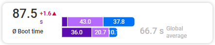
- Boot time: The average boot time of the selected endpoints is compared with the global average, i.e. the average boot time of all environments recorded in baramundi Proactive Hub. The trend is shown with the small number (see tooltip).
- CPU utilization: The average CPU utilization of the selected endpoints is compared with the global average, i.e. the average CPU utilization of all environments recorded in baramundi Proactive Hub. The trend is shown with the small number (see tooltip).
- RAM utilization: The average RAM utilization of the selected endpoints is compared with the global average, i.e. the average RAM utilization of all environments recorded in baramundi Proactive Hub. The trend is shown with the small number (see tooltip).
The second overview tile shows the currently measured status (the most recently sent data) of the battery, hard drives, and storage space of all endpoints in the environment.

- Battery health: good, moderate, bad
- Hard drive health: good, caution, bad
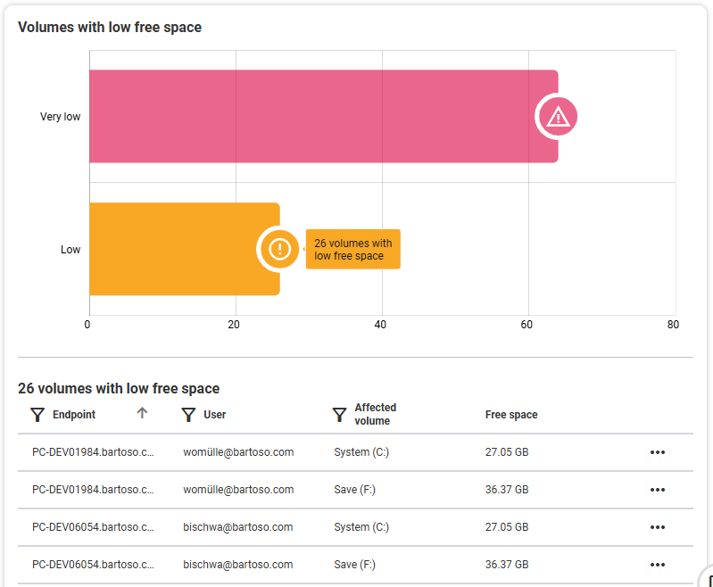
- Volumes with low free space: A distinction is made between volumes with low and very low free storage space.
Measurement
In the Measurement section, you can see all the endpoints of your selected environment listed in the selected time period, sorted by endpoint name by default. Here you'll find an explanation of the table functions.
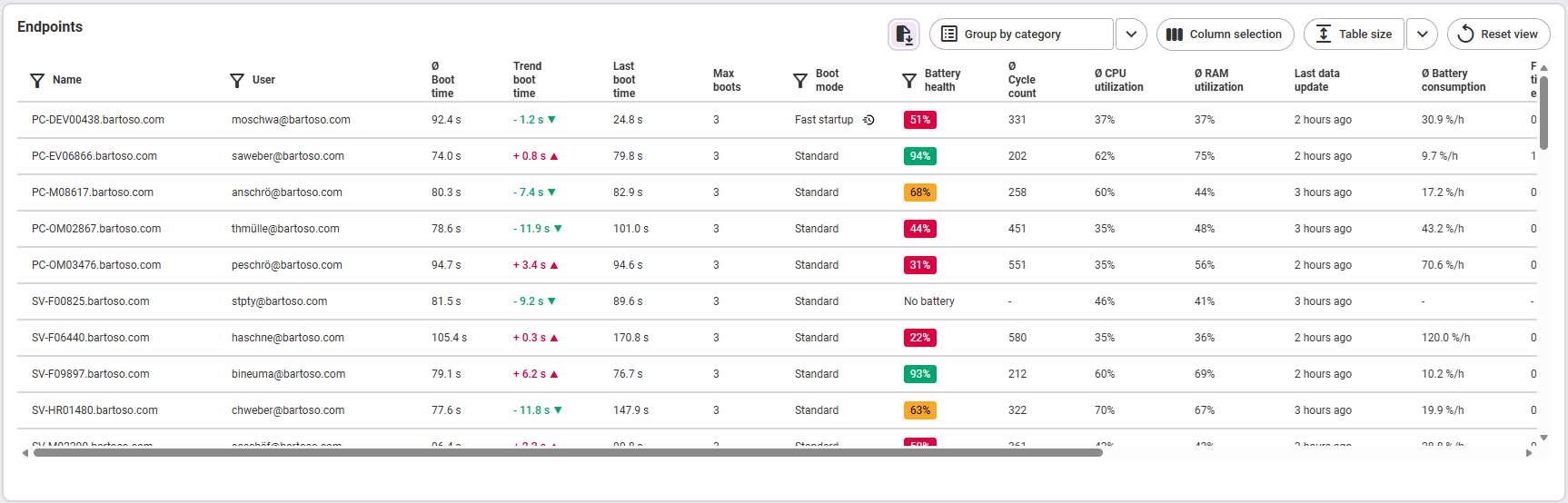
The following information is available:
- Name (of the endpoint)
- User: name of the user (of the endpoint)
- average boot time on the endpoint
- Trend boot time: the change compared to the past period
- Last boot time: duration of the last boot
- Max boots: maximum boot counts per day within the selected time period
- Boot mode (on the endpoint)
- Battery health of the endpoint
- average number of cycle counts
- average CPU utilization
- average RAM utilization
- Last data update (the values are transmitted by the agent and may differ depending on the area)
- average battery consumption in percent per hour
- full battery time estimate (in battery mode with a fully charged battery)
- Worst hard drive health (red = bad, yellow = caution, green = good, "-" = no data): Clicking on the status takes you directly to the endpoint (Performance section).
- Free volume space (red = very low, yellow = low, green = sufficient, "-" = no data): In the yellow and red statuses, the tooltip shows the affected drives. Clicking on the status takes you directly to the endpoint (Performance section).
Analysis
The analysis area differs depending on which category you select in the tabs on the left.
Boot time
The overview graph shows you details of boot time over the selected time period for all endpoints in the selected environment. Note: The boot time is again compared to the global average. The color-coded sections show the BIOS runtime, the duration of user input, and the time spent logged in at the desktop (as shown in the tooltip).
Below that follows the overview over time: you can see the average boot time per day for all endpoints. By clicking on a point in time in the graphic on the left, you can see the endpoints affected on this day with their users and the individual boot time data in the corresponding table on the right. Use the three-dot menu on the right of each endpoint to open it in the detail view.
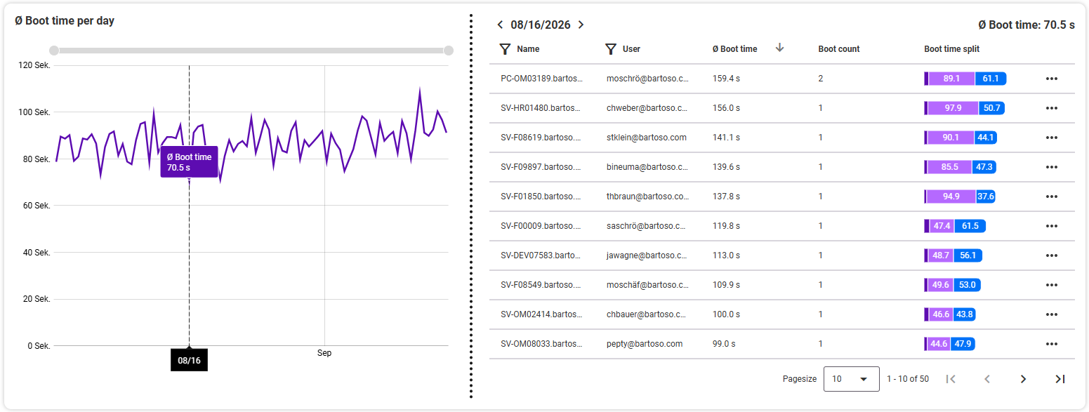
Zoom and time period: In the top left and bottom right graphs of the analysis area, select the time period by using the mouse wheel (zoom in/out) or the zoom bars top and right. The time period of the Flop 10 endpoints can be set separately from the otherwise selected time period.
In the two graphs below, you can see the flop 10 boot times per endpoint on the left side, and the distribution of the endpoints on the average boot time on the right side.
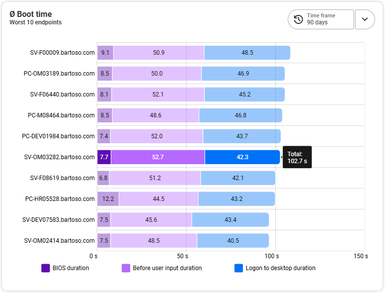
Average boot time: Worst 10
The left graph shows you the worst 10 boot times per endpoint. The vertical axis shows the names of the affected endpoints, and the horizontal axis shows the length of the boot time, divided into BIOS runtime, duration before user input, and desktop login time. Clicking on an endpoint opens the detail view for that endpoint.
Average boot time: distribution of endpoints
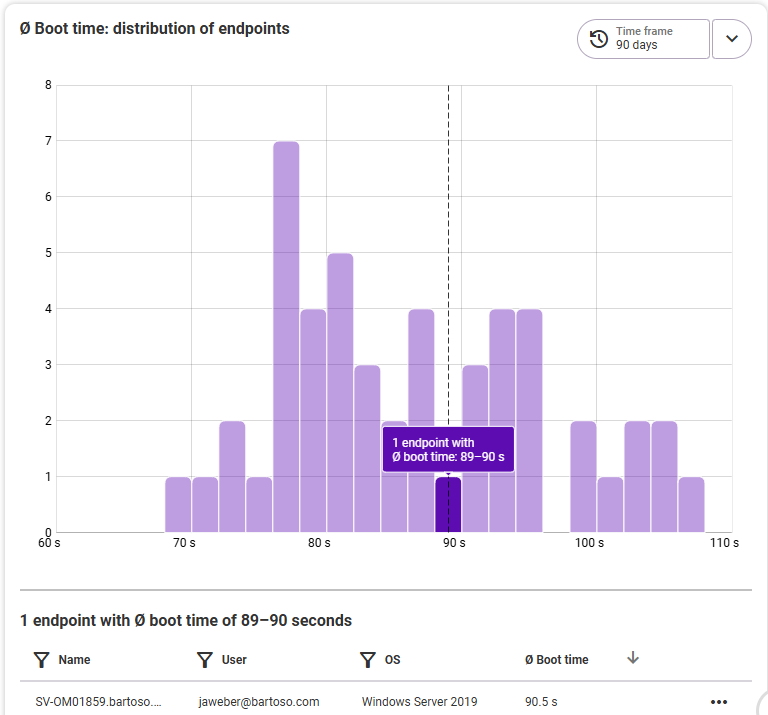
In the right graph you can see the distribution of all endpoints of the selected environment with their average boot time in the bar chart. By hovering the mouse over each bar, you can see the details in the tooltip: How many endpoints are affected by this average boot time at the selected time period? Clicking on a bar will open the details as well as the affected endpoints below the chart. From there, click on an endpoint to jump directly to its detail view.
Battery
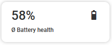
In the Battery category, at the very top, you will also first see an overall view of the average battery health of all endpoints.
Battery health over all endpoints
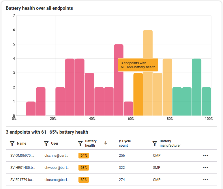
Here you can see the distribution of all endpoints on their average battery state in a bar chart. Clicking on a bar will open the details below the chart: you will then see the list with the corresponding endpoints that fall within the selected range, including their exact battery value as well as the number of charge cycles and the battery manufacturer. Clicking on one of the endpoints will take you to the corresponding detail view.
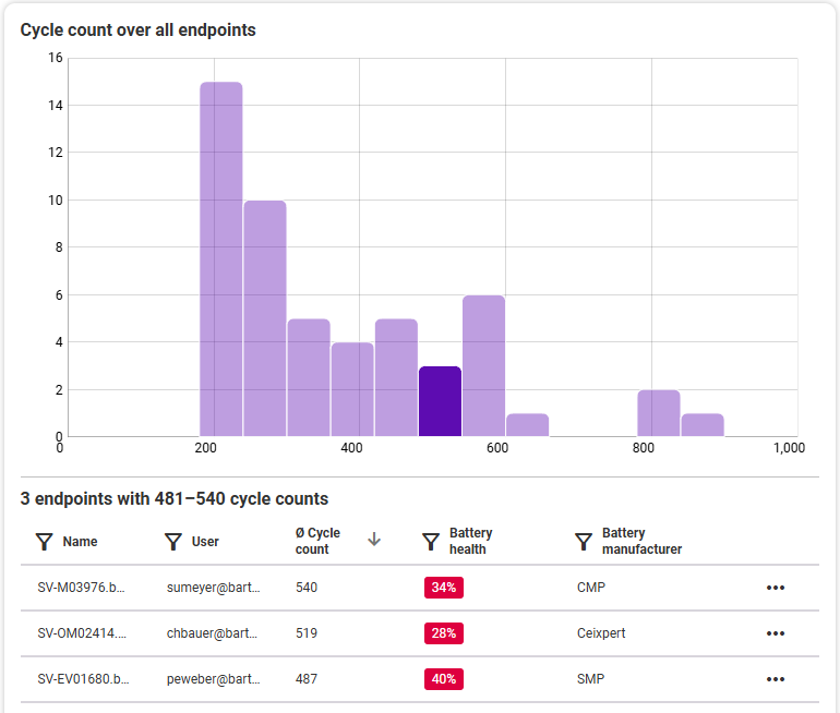
Cycle count over all endpoints
In this bar chart you can see the distribution of cycle counts by quantity of endpoints and duration of the cycle count. Click on a sub-area in the chart to see its details below. You will then get the list of the corresponding endpoints for the selected cycle count with details about the average amount of cycle counts, battery state as well as battery manufacturer. Clicking on one of the endpoints will take you to the corresponding detail view.
CPU
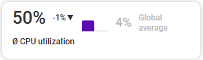
The overview tile shows you the average CPU utilization of the selected endpoints. This is compared with the global average, i.e. the average CPU utilization of all environments recorded in baramundi Proactive Hub. The trend is shown with the small number (see tooltip).
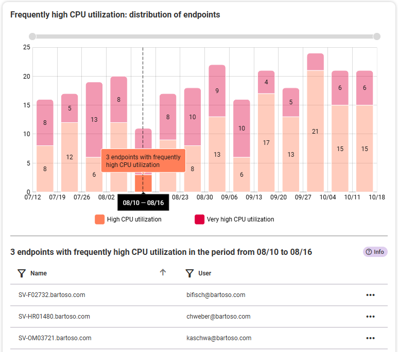
Frequently high CPU utilization: distribution of endpoints
The graphic shows you the endpoints that are frequently affected by very high or high CPU utilization. The period always covers the past 90 days. The individual bars always show the average value for a week or seven days (Monday to Sunday). Within the bars you can see the distribution between the two utilization levels (high/very high). Change the temporal view by using the mouse wheel or the gray zoom bar at the top of the graph to zoom in or out. The blue minus icon resets the zoom status back to the full time period.
Details: As soon as you select a bar and its range (high/very high) in the chart, you will see a list of the endpoints affected in this period below the chart. From this list, you can navigate directly to the detail views of the individual endpoints or open them in a new tab using the three-dot menu.
Erklärung:
Frequently very high: All endpoints that had a minimum CPU utilization of more than 40 % in 80 % of the recorded time and a maximum CPU utilization of more than 80 % in 20 % of the recorded time.
Frequently high: All endpoints that either had a minimum CPU utilization of more than 20 % in 80 % of the recorded time or a minimum CPU utilization of more than 40 % in 60 % of the recorded time and that had a maximum CPU utilization of more than 80 % in 20 % of the recorded time.
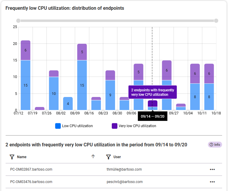
Frequently low CPU utilization: distribution of endpoints
The chart shows you the endpoints that are frequently affected by very low or low CPU utilization. The period always covers the past 90 days. The individual bars always show the average value for a week or seven days (Monday to Sunday). Within the bars you can see the distribution between the two utilization levels (high/very high). Change the temporal view by using the mouse wheel or the gray zoom bar at the top of the graph to zoom in or out. The blue minus icon resets the zoom status back to the full time period.
Details: As soon as you select a bar and its range (high/very high) in the chart, you will see a list of the endpoints affected in this period below the chart. From this list, you can navigate directly to the detail views of the individual endpoints or open them in a new tab using the three-dot menu.
Erklärung:
Frequently very low: All endpoints that had a maximum CPU utilization of less than 20 % in 80 % of the recorded time and always a maximum CPU utilization of less than 60 %.
Frequently low: All endpoints that either had a maximum CPU utilization of less than 40 % in 80 % of the recorded time or a maximum CPU utilization of less than 20 % in 60 % of the recorded time and that always had a maximum CPU utilization of less than 60 %.
Average CPU utilization: distribution of endpoints
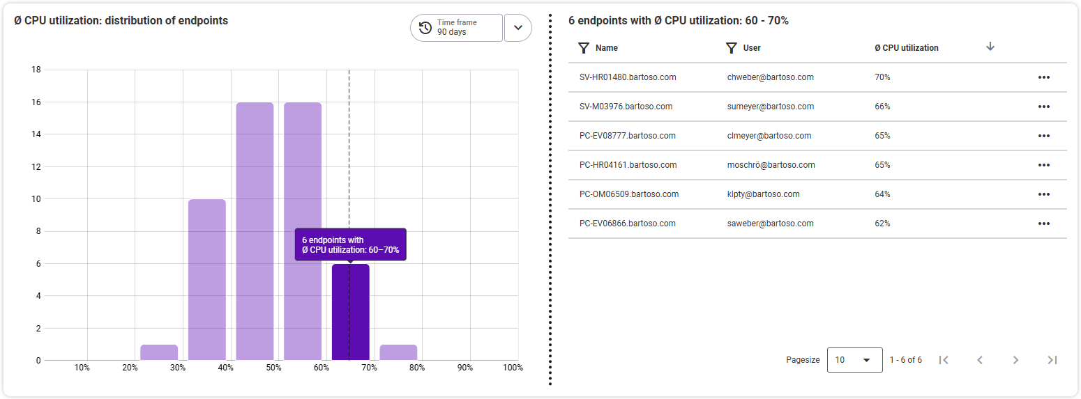
Here you can see how the average CPU utilization is distributed across the endpoints in the selected time period. To see the individual endpoints of an average utilization level, select the desired bar on the left: You will see the list of affected endpoints with the corresponding utilization on the right-hand side. From this list, you can navigate directly to the detail views of the individual endpoints or open them in a new tab using the three-dot menu.
RAM
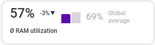
The overview tile shows you the average RAM utilization of the selected endpoints. This is compared to the global average, which is the average RAM usage of all environments tracked in baramundi Proactive Hub. The trend is shown with the small number (see tooltip).
Frequently high RAM utilization: distribution of endpoints
The graphic shows you the endpoints that are frequently affected by very high or high RAM utilization. The time period always covers the last 90 days. The individual bars always show the average value of a week or seven days (Monday to Sunday). Within the bars, you can see the distribution between the two utilization levels (high/very high). Change the time view by using the mouse wheel or the gray zoom bar at the top of the graphic to zoom in or out. The blue minus icon resets the zoom state back to the full period.
Details: As soon as you select a bar and its area (high/very high) in the diagram, you will see a list below the graphic with the affected endpoints in this period. From this list, you can navigate directly to the detailed views of the individual endpoints or open them in a new tab via the three-dot menu.

Erklärung:
Frequently very high: all endpoints that had a minimum RAM utilization of over 50 % in 80 % of the recorded time and a maximum RAM utilization of over 90 % in 20 % of the recorded time
Frequently high: all endpoints that had a minimum RAM utilization of over 50 % in 80 % of the time captured or a minimum RAM utilization of over 60 % in 60 % of the time captured and that had a maximum RAM utilization of over 85 % in 20 % of the recorded time
Frequently low RAM utilization: distribution of endpoints
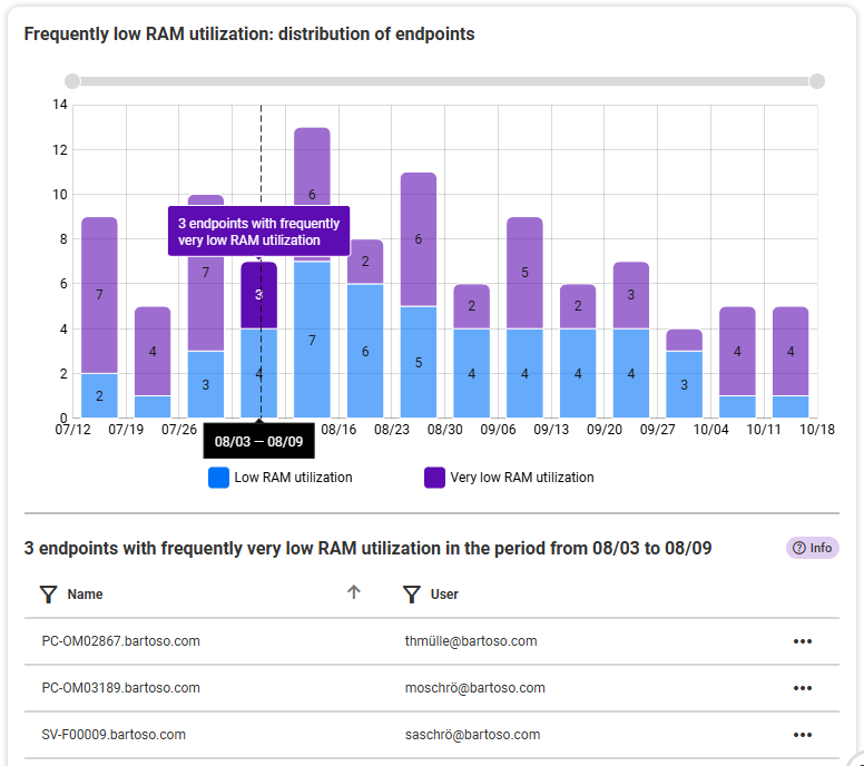
The graphic shows you the endpoints that are affected by frequently very low or low RAM utilization. The time frame always covers the past 90 days. The individual bars always show the average value of a week or seven days (Monday to Sunday). Within the bars, you can see the distribution between the two utilization levels (high/very high). Change the time view by using the mouse wheel or the gray zoom bar at the top of the graphic to zoom in or out. The blue minus icon resets the zoom state back to the full period.
Details: As soon as you select a bar and its area (high/very high) in the diagram, you will see a list below the graphic with the affected endpoints in this period. From this list, you can navigate directly to the detailed views of the individual endpoints or open them in a new tab using the three-dot menu.
Erklärung:
Frequently very low: all endpoints that had a maximum RAM utilization of less than 30 % in 80 % of the time recorded and always had a maximum RAM utilization of less than 50 %
Frequently low: all endpoints that had a maximum RAM utilization of less than 40 % in 80 % of the time captured, or had a maximum RAM utilization of less than 30 % in 60 % of the time captured , and that always had a maximum RAM utilization of less than 60 %
Average RAM utilization: distribution of endpoints
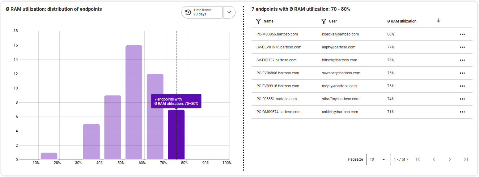
Here you can see how the average RAM utilization is distributed across the endpoints in the selected time period. To see the individual endpoints of an average utilization level, select the desired bar on the left: On the right side, you will see the list of affected endpoints with the corresponding utilization. From this list, you can navigate directly to the detailed views of the individual endpoints or open them in a new tab using the three-dot menu.
Hard drive
The overview tile shows you the currently measured status (the most recently sent data) of hard drives and storage space for all endpoints in the environment.
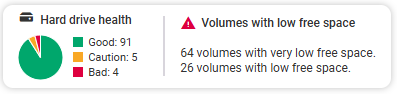
- Hard drive health distribution: good, caution, bad
- Volumes with low free space A distinction is made between volumes with low and very low free storage space.
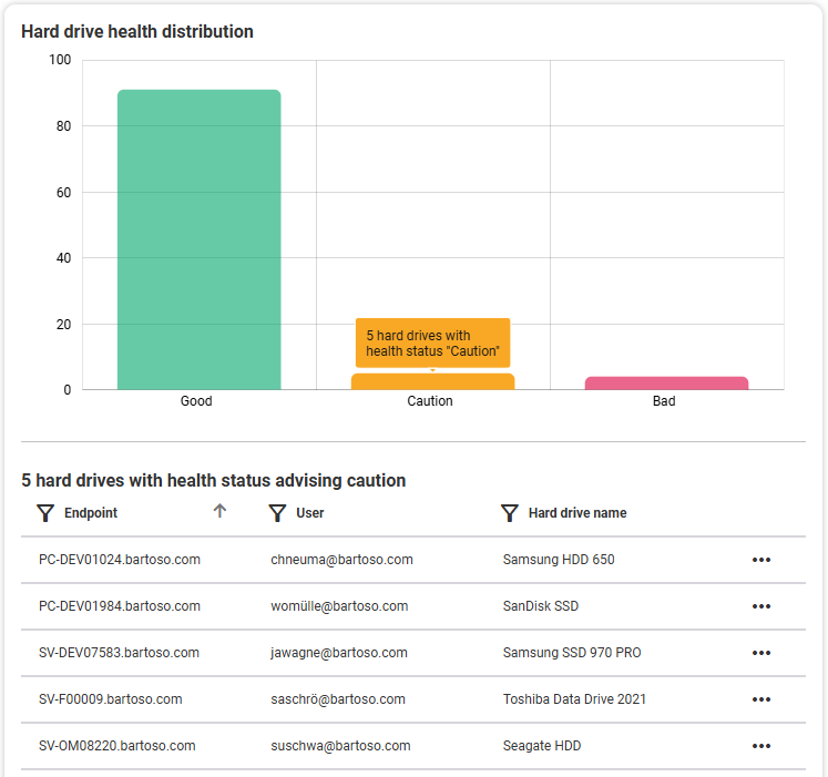
Hard drive health distribution
The bar chart shows the distribution of hard drive statuses for all endpoints in the environment. The statuses are based on the overall hard drive health. The tooltip for the bars in the chart shows you how many endpoints are affected by the respective status.
Details: If you click on a bar, you will see a table below the chart with all endpoints affected by the selected status (by default, no status is selected, so no table is visible). Here you will see the columns: endpoint name, endpoint user, hard drive name. From this list, you can navigate directly to the detailed views of the individual endpoints or open them in a new tab using the three-dot menu.
Volumes with low free space
This bar chart shows you the distribution of drives with low and very low free storage, again based on all endpoints in the environment. The status “very low” means that less than 10 GB is free or less than 5% of the total storage. The status “low” means that less than 20 GB is free or less than 10% of the total storage. The tooltip for the bars in the chart shows you how many endpoints are affected by the respective status.
Details: When you click on a bar, you will see a table below the diagram with all endpoints affected by the selected status (by default, no status is selected, so no table is visible). Here you will see the columns: endpoint name, endpoint user, affected volume name, free space. If it is a system drive, it is displayed in bold. From this list, you can navigate directly to the detail views of the individual endpoints or open them in a new tab using the three-dot menu.