
Summary
First select your active environment in the top right corner. All environments you have access to are available.
Using the magnifying glass icon at the top, a global search function is available.
Summary Tiles

Environment Stability Score
The first tile shows the average stability of the selected environment. The time frame is the same as the one selected in the Measurement section. Clicking on this tile opens a window with details on environmental stability:
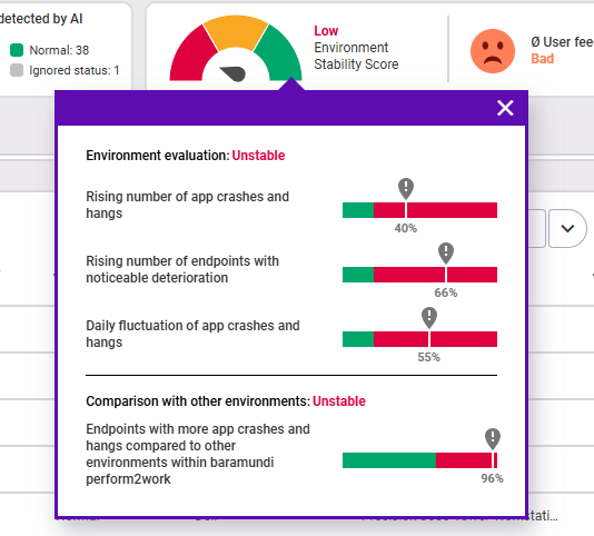
The calculation of the value is composed of the following four indicators:
- Increase in app crashes and hangs: The value indicates by what percentage the crashes and hangs have increased compared to the previous period. If the value is more than 20 % above the previous period, the indicator is in the red zone.
- Increase in endpoints with noticeable degradation: The value indicates the number of endpoints that have an increase in app crashes and hangs of more than 20 % from the previous period. If this value is above 20 %, the indicator is in the red zone.
- Daily fluctuation of app crashes and hangs: This value is calculated using the average number of events per day. If this value is above 20 %, the indicator is in the red zone.
- Endpoints with more app crashes and hangs compared to other Proactive Hub environments: This value gives the mean (more precisely, the median) of events per day from all endpoints across Proactive Hub. This value serves as a benchmark: If more than 60 % of the endpoints in the environment are above this daily mean value here, the indicator is in the red zone.
There are three levels:
- High: All indicators are in the green zone.
- Medium: Exactly one indicator is in the red zone.
- Low: Two or more indicators are in the red range.
Environment rating:
- Stable: The selected environment is rated as stable if all the above indicators are in the green range.
- Unstable: The selected environment is rated as unstable if one or more of the above indicators are in the red range.
Note:
In case there is still too little data available in your environment, you will see a yellow note. The Environment Stability Score can only be calculated as soon as data of at least twice the period is available than the period you have chosen (example: for the score of 30 days, the data of the last 60 days is required). The minimum period of necessary data to calculate the score is two weeks.
User feedback
The second tile shows the average user feedback for the selected period (adjustable in the Measurement section).
Distribution of anomalies detected by AI
The Distribution of anomalies detected by AI tile uses a pie chart to show you how the anomalies detected from the Insights are distributed in the environment. The following areas are distinguished:
- Red: all endpoints for which a high degree of anomaly was detected via AI
- Yellow to orange: all endpoints for which a moderate degree of anomaly was detected via AI
- Green: all endpoints with a normal level of anomaly detected by AI (neither high nor moderate)
- Gray: all endpoints with ignored status (for an explanation of ignored status, see Insights)
Measurement
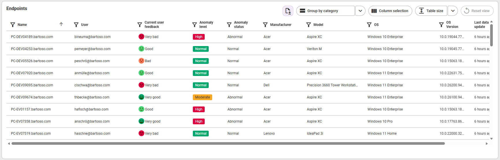
In the Measurement section, you can see all endpoints available in the selected environment listed. The endpoints are sorted by name. Here you'll find an explanation of the table functions. The following information is available:
- Name
- User
- Current user feedback
- Manufacturer
- Model
- Operating System
- OS Version
- Last data update (the values are transmitted by the agent and may differ depending on the area)
- Anomaly level (high, moderate or normal)
- Anomaly status (normal, abnormal or ignored; The status “-” indicates that no measurement has yet been taken at this endpoint or that no categorization has yet taken place due to a lack of data.)
Analysis
Environment Stability Score over time
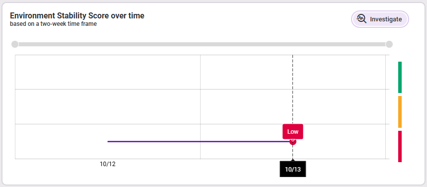
The analysis graph shows the moving average stability value (over two weeks) of the selected environment over time. Use the gray slider to zoom into specific temporal sub-areas. By hovering the mouse over the timeline, you can see the respective status at the corresponding date: green = high stability, yellow = medium stability, red = low stability.
Clicking Investigate takes you to the Stability tab, which gives you a detailed analysis of app hangs and crashes to the endpoints of the selected environment.
Average user feedback over time
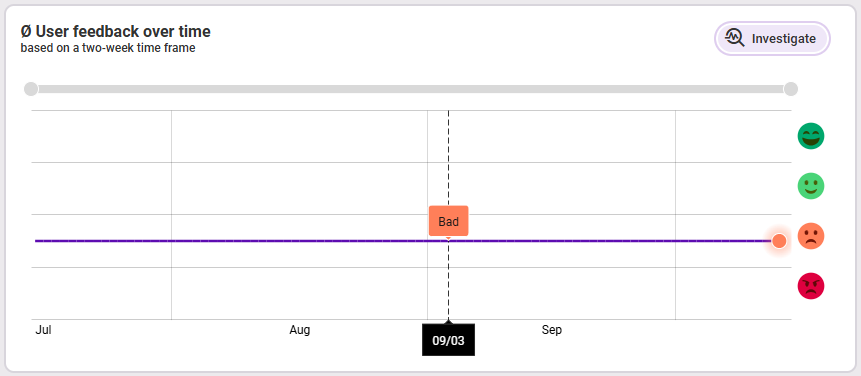
The graph shows the moving average value of user feedback (over two weeks) over time. By turning the mouse wheel or using the gray slider at the top of the slider at the top of the graph to zoom in or out. If you move the mouse over the timeline, you will see the details of the individual days in the tooltip.
Clicking on Investigate takes you to the User feedback tab, which gives you a detailed analysis of user satisfaction in this environment.
Distribution of endpoints by anomaly level over time
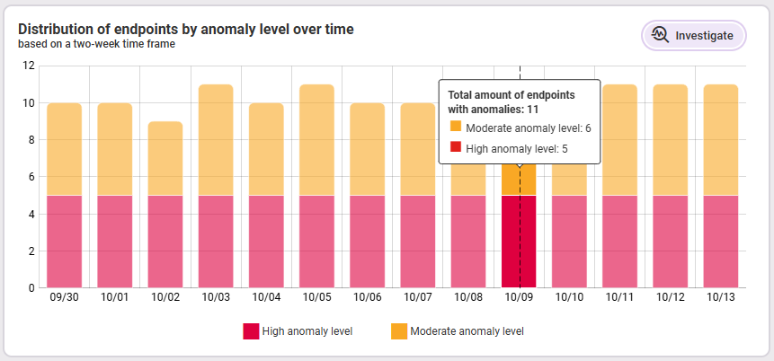
This graph shows all endpoints with a high and moderate anomaly level over a period of two weeks. This allows you to see at a glance how the number of endpoints affected by anomalies in the selected environment has developed over the last two weeks. Improvements and deteriorations can be seen quickly and easily.
The y-axis always shows you the number of affected endpoints (yellow and red together) on the respective day/date (x-axis). The tooltip shows you the total number of abnormal endpoints on that date as well as the number of endpoints with high and moderate values.
Clicking on Investigate takes you to the Insights section, which gives you a detailed analysis of via AI detected anomalies in this environment.