
Performance
In the first overview tile you see a summary of the data (average boot time, average CPU and RAM utilization) for the endpoint in the selected time period.
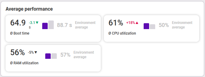
- Average boot time of the endpoint in seconds (small number shows trend compared to the chosen timeframe before) compared to the average of all endpoints in the area
- Average CPU utilization of the endpoint in percent (small number shows trend compared to the chosen timeframe before) compared to the average of all endpoints in the environment
- Average RAM utilization of the endpoint in percent (small number shows trend compared to the chosen timeframe before) compared to the average of all endpoints in the environment
The second overview tile shows you the current status (latest data) of the battery, hard drives, and storage space. A note on the respective values tells you whether action is recommended.
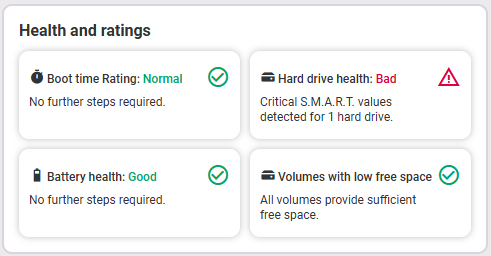
- Battery health (good, moderate, critical)
- Hard drive health (good, caution, bad)
- Volumes with low free space
Measurement
The Measurement section shows a list of all applications installed on the endpoint in the selected time period, sorted by application name (descending) by default. Here you'll find an explanation of the table functions.
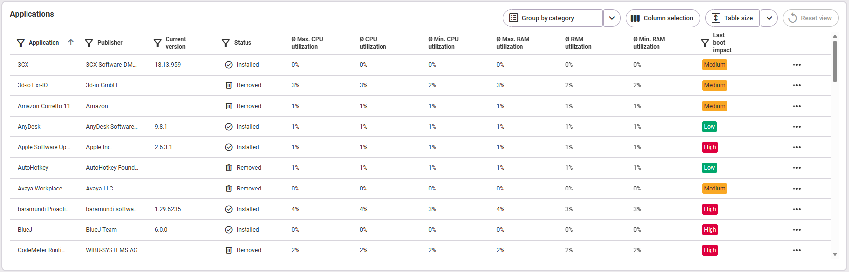
The following information about the applications is available:
- Name of the application
- Publisher of the application
- Current version
- Status (installed: the application was installed at the last inventory scan; removed: the application was installed within the selected time frame but was removed before the last inventory scan; unknown: the application is a system application or the application cannot be clearly assigned)
- Average maximum CPU utilization (the average of all maximum CPU utilization values in the selected time frame)
- Average CPU utilization
- Average minimum CPU utilization (the average of all minimum CPU utilization values in the selected time period)
- Average maximum RAM utilization (the average of all maximum RAM utilization values in the selected time period)
- Average RAM utilization
- Average minimum RAM utilization (the average of all minimum RAM utilization values in the selected time period)
- Last boot impact (more information on this can be found below in the section Analysis > Boot time > Boot impact by application)
Analysis
The analysis area differs depending on the selected category (tabs on the left).
Boot time
The first thing you see here is an overview with the most important data (fig. from left to right):

- The type of boot mode (standard or fast startup)
- The average boot time of the endpoint with the trend compared to the chosen timeframe before shown in the small superscript number as well as the comparison with the environment average (gray); meaning of colors: dark blue = BIOS runtime, mint green = duration before user input, light blue = desktop logon duration
- The duration of the last boot time; meaning of colors: dark blue = BIOS runtime, mint green = duration before user input, light blue = desktop logon duration
- The average number of boots per week
Last boot times – overview over time
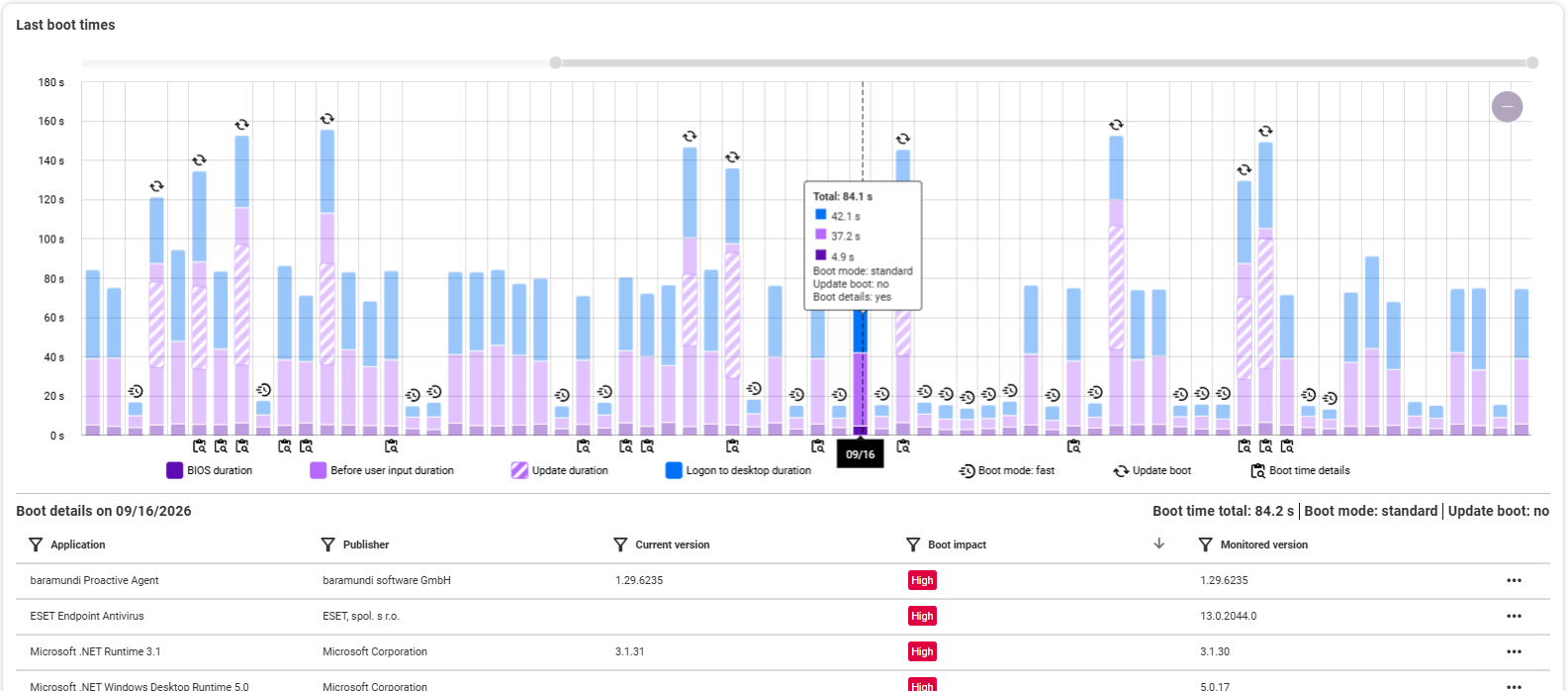
For every boot process you can see, in the selected time period, the boot time of the endpoint. You can change the time period above in the measurement area. Alternatively, you can use the mouse wheel in the diagram to zoom in and out within the available time period or use the gray zoom bar at the top of the graphic. Note: To see the icons for boot mode, update boot, and boot time details, you may need to zoom in on the graphic:
- Boot mode: fast: The device was booted in fast boot mode.
- Update boot: An update took place during the boot process, which may have delayed the boot time.
- Boot time details: Details are available for this boot process.
For each boot process, you can see the BIOS duration, before user input duration, update duration and desktop logon duration in seconds. If there are boot details for a boot process, the bar is marked with a clipboard icon below. The tooltip shows you the most important data for the selected day at a glance. If boot details are available, clicking on a bar in the diagram will display below a list of applications and their details at the selected time. In addition, you will see the total boot time and boot mode for that day at the top right of the list, as well as whether it was an update boot. The details include the following information:
- Name of the application
- Publisher of the application
- Current version
- Boot impact (on this day)
- Monitored version
Clicking on an application or using the three-dot menu on the right at the end of the row opens its detailed view. The table can be filtered and sorted using the respective icons next to the column headings.
Boot impact by application
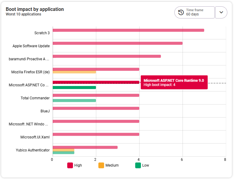
This graphic shows an overview of the flop 10 applications that had the greatest boot impact on the endpoint during the selected time period. Clicking on an application bar takes you to its detailed view.
Notes on boot impact
1) The data used to calculate the boot impact on an endpoint comes from the file used by Windows for the Task Manager.
2) To ensure that the data is up to date, only data that is no more than 30 days old is used to calculate the boot impact.
3) The categorization into high, medium, and low boot impact is based on Microsoft's classification. For more information, please refer to the Microsoft documentation.
Boot time split details
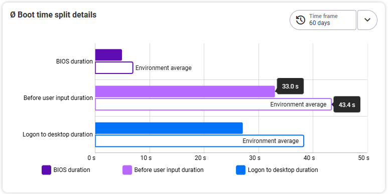
The time period can be selected separately here (top right). The graph shows the averages for
- BIOS duration,
- time before user input,
- and time to log in to desktop.
All three values are compared to the average environment, i.e. the average of all environments in baramundi Proactive Hub.
Last boot counts
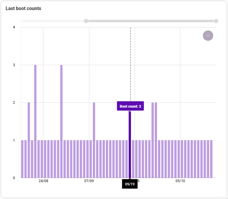
This shows how often the device was started per day during the specified period. If the values are high, this may indicate that the user is having problems with the device and that the administration needs to take action.
Battery
In the Battery section, at the very top, you will also first see two tiles with an overall view of the average battery status of the endpoint and all the important information about the battery itself (see fig. from left to right):
Tile 1:

- overview of the technical data of the battery (name, manufacturer, capacity, condition, charge cycles)
- current battery health
- evaluation of the battery health and recommended actions
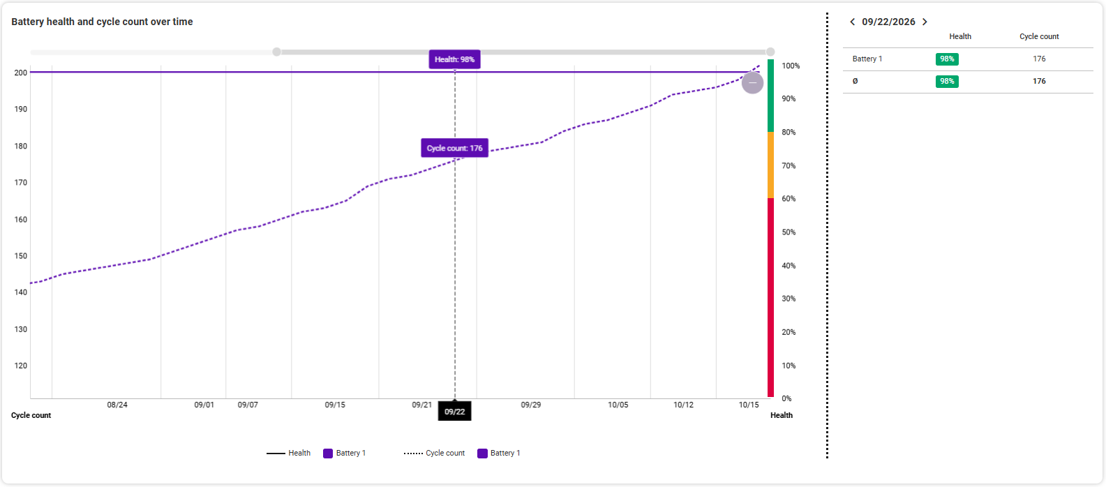
The classification of the battery health is in three stages: green = good (81-100 %), yellow = moderate (61-80 %) and red = critical (0-60 %). The coloring of the battery health values is also based on these percentage ranges. The recommended action is finally based on the battery condition and advises you to replace the battery if necessary.
Tile 2:

- Average battery consumption in percent and per hour
- Average energy consumption in milliwatts in battery mode compared to the average of all devices in the environment
- Estimate of the runtime of the endpoint in battery mode with a fully charged battery
In the graph below the overview you can see Battery health and cycle count over time. The left y-axis shows you the cycle count, the right y-axis the state of the battery with the corresponding colors. Scrolling with the mouse wheel zooms in and out in the available timeframe. Hovering with the mouse over individual areas of the graphic shows you the details of the respective day for the charging cycle and battery status. By clicking on a time in the graph, you see the details of this day listed on the right.
Actions > Forward data
The Actions button is located at the top right of the Battery section. Here you have the option of forwarding the data to an email recipient. The settings for this can be found in the administration area under Adjust Action Settings.
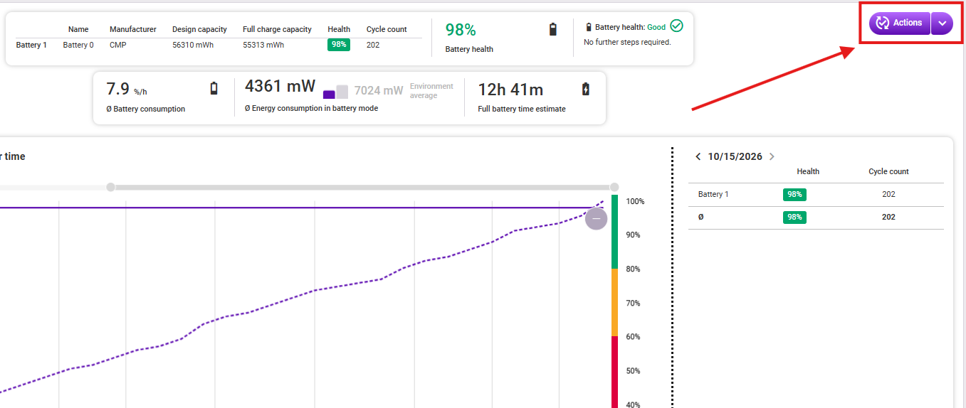
Clicking it opens a drop-down menu with the Forward battery data function. Clicking this opens a dialog that allows you to edit the Subject and enter Additional information. By default, the subject is “Battery analysis.” The following information is also listed for sending:
- Who is sending this email: The user's email is entered here.
- From which category of the baramundi Proactive Hub app do the data originate?
- What is the name of the endpoint from which the data originate?
- What is the current/last battery status?
- Table with all overview data on battery status:
- Battery name
- Battery manufacturer
- Design capacity (nominal capacity) of the battery in milliwatt-hours (mWh)
- Remaining capacity of the battery: How much actual capacity does the battery still have in milliwatt-hours (mWh)?
- Battery status: green = good (81–100%), yellow = moderate (61–80%), red = critical (0–60%)
- Number of charge cycles the battery has already undergone.
Finally, click Send if you want to forward the data of the selected endpoint to the configured target address.
Note
If the Forward data feature is not yet globally activated, a notice will appear when attempting to send. An environment administrator must first activate the feature in the administration area under Adjust Action Settings.
CPU

Under the CPU tab, you can see right at the top general information about the CPU as well as the average CPU utilization in the chosen timeframe, given as a percentage. The small superscript number shows the extent to which the average utilization has changed compared to the chosen timeframe before. To the right, the gray number shows the comparison with the environment average, i.e. the average of all endpoints recorded in the environment. The following CPU information is available:
- CPU description
- CPU type
- CPU speed (MHz)
- CPU count
- CPU logical cores (quantity)
- CPU physical cores (quantity)
CPU utilization
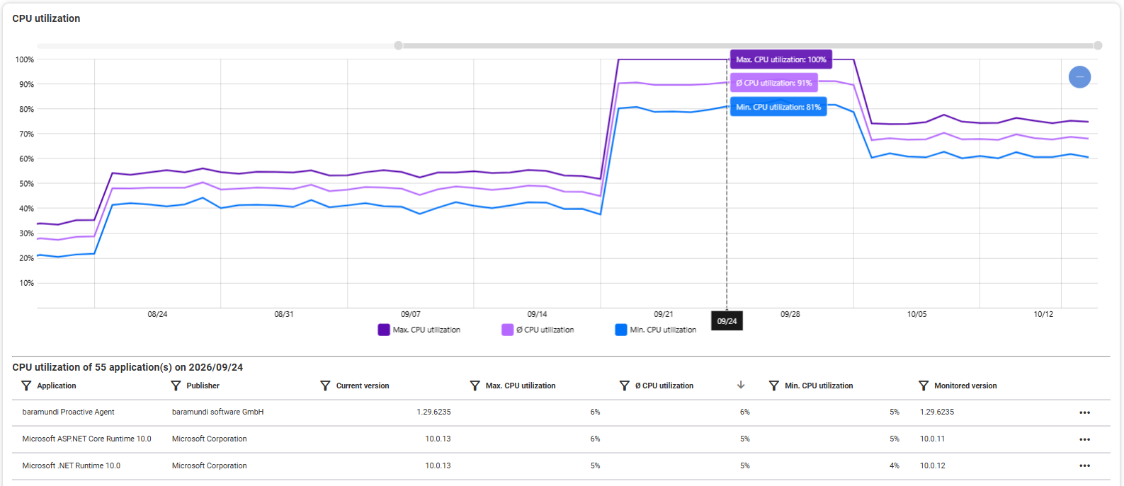
The CPU utilization graph shows how the CPU utilization of the selected endpoint has changed over time. Zoom in and out over time using the mouse wheel or the gray zoom bar at the top of the graph. Use the blue minus icon on the right to zoom out again to the entire available range.
The progressions of the following three values are displayed:
- Maximum CPU utilization
- Minimum CPU utilization
- Average CPU utilization
Detailed view in the tooltip: By hovering over individual points in the graph with the mouse, you can see the respective values for this point in time in the tooltip.
List of applications: Click on a point in the diagram to see a list below with all the applications (with CPU activity) recorded for this date. All running applications except Windows services are recorded. The table provides you with information about:
- Name of the application
- Publisher of the application
- Current version (installed on the endpoint)
- Maximum CPU utilization (of the application at the selected time)
- Average CPU utilization (of the application at the selected time)
- Minimum CPU utilization (of the application at the selected time)
- Monitored version (of the application at the selected time)
Clicking on an application in the list will open it in its detailed view. Alternatively, this is possible via the three dots at the right end of each line.
CPU utilization by application
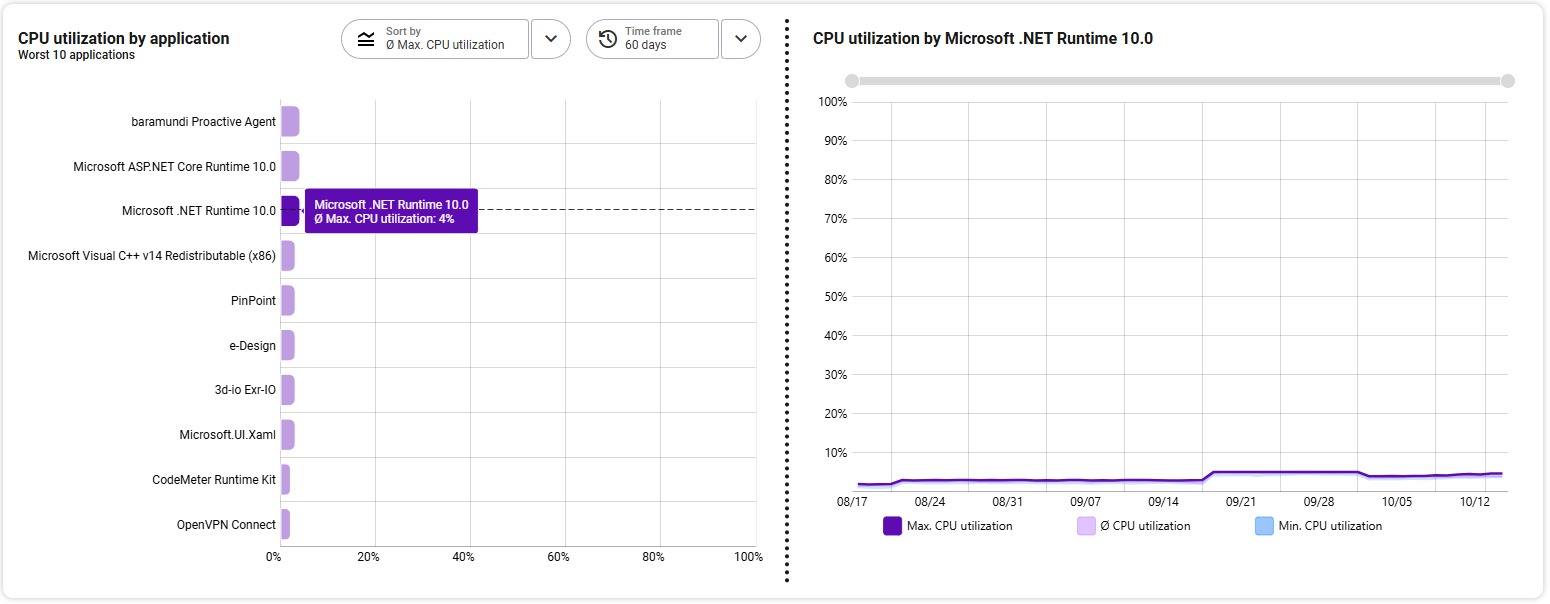
The diagram «Flop 10 Applications» lists the ten applications from the three selectable ranges that had the greatest/worst values over the selected time period. The following areas are available:
- Maximum CPU utilization
- Average CPU utilization
- Minimum CPU utilization
Regardless of the sorting, the largest value is always at the top. The x-axis shows the CPU utilization value. Select the desired time period for which the values are to be displayed in the top right. By default, the measurement range time period is adopted.
On the right side, you can see the details of the application selected on the left in a separate graphic. The area selected on the left (max./min./average CPU utilization) is highlighted in color on the right and shows the corresponding CPU load of this application over the course of the selected time period. The two areas not selected are also available for comparison in a more subtle color. Change the selected time frame by zooming into the graphic with the mouse wheel or using the gray zoom bar at the top edge.
Detailed view in the tooltip: By hovering with the mouse over individual points in the graphic, you can see the respective value for the selected area at this time in the tooltip.
RAM
The overview shows you the most important data at a glance (fig. from left to right):
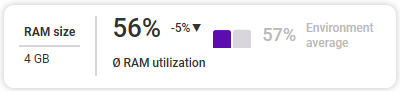
- The RAM size of the selected endpoint
- The average RAM utilization of the selected endpoint in the selected period and the development trend as a small, superscript
- The comparison with the average RAM utilization of all endpoints from the selected environment
Below is the overview of the RAM utilization over time. You will always see a maximum of 90 days. If you have selected a smaller time period above, the graphic will automatically zoom in accordingly. You can change the zoom level as required using the grey zoom bars or by using the mouse wheel.
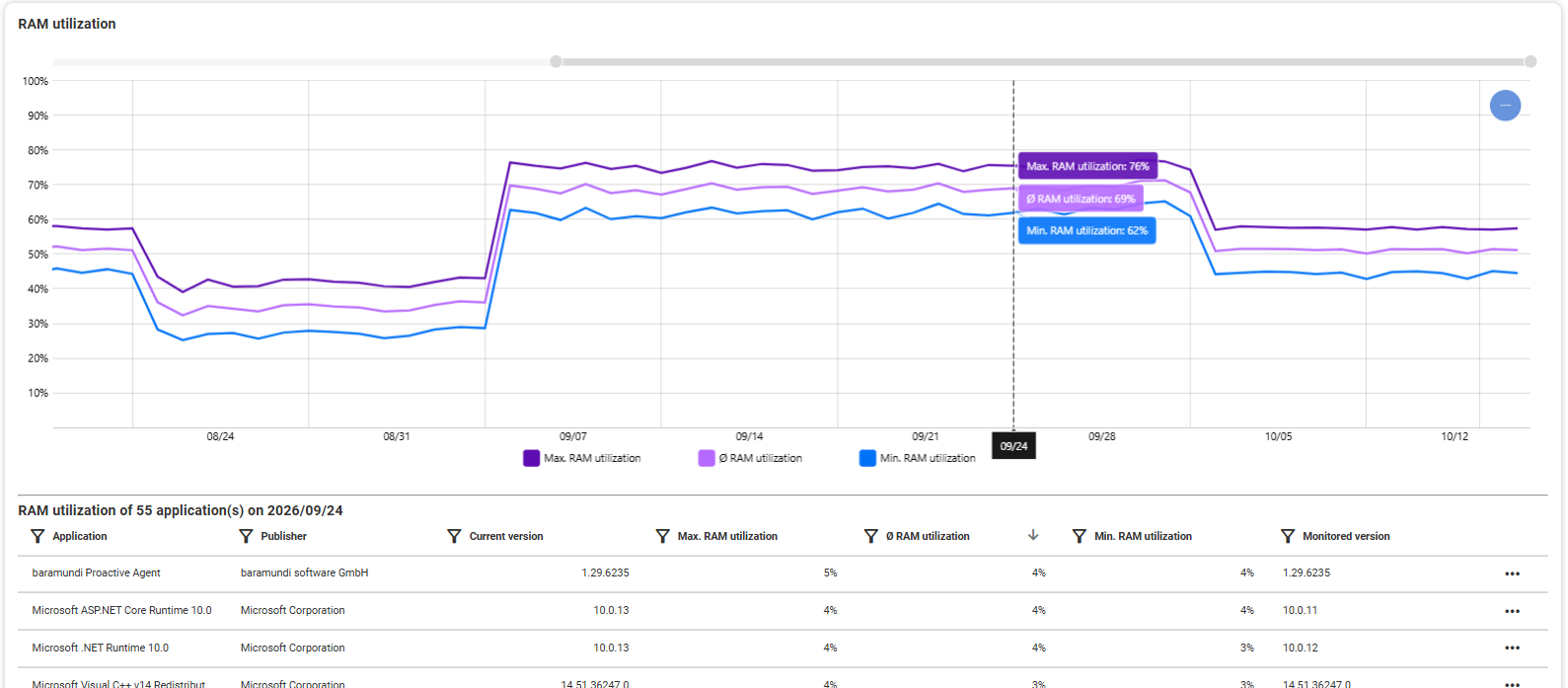
The graph shows the maximum, minimum and average RAM usage over a maximum period of 90 days (or less, depending on the zoom level). If you hover over the history with the mouse, you will see the corresponding values for each day in the tooltip.
List of applications: When you click on a point in the graph, a table appears below. It shows every application that generated RAM data on the selected date and is sorted by default according to average RAM usage. The table provides you with information about:
- Name of the application
- Publisher of the application
- Current version (installed on the endpoint)
- Maximum RAM utilization (of the application at the selected time)
- Average RAM utilization (of the application at the selected time)
- Minimum RAM utilization (of the application at the selected time)
- Monitored version (of the application at the selected time)
Clicking on an application in the list will open it in its detailed view. Alternatively, this is possible via the three dots at the right end of each line.
RAM utilization by application
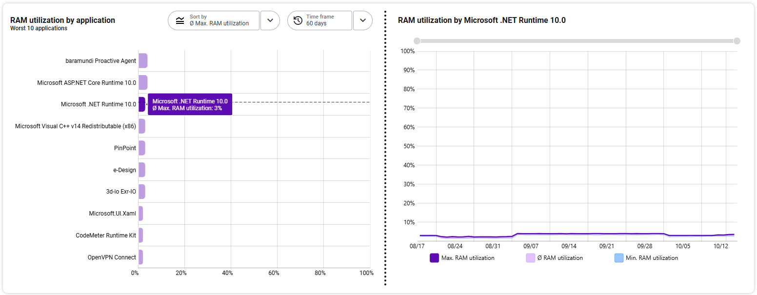
The diagram «Flop 10 Applications» lists the ten applications from the three selectable ranges that had the greatest/worst values over the selected time period. The following areas are available:
- Maximum RAM utilization
- Average RAM utilization
- Minimum RAM utilization
Regardless of the sorting, the largest value is always at the top. The x-axis shows the RAM utilization value. Select the desired time period for which the values are to be displayed in the top right. By default, the measurement range time period is adopted.
On the right side, you can see the details of the application selected on the left in a separate graphic. The area selected on the left (max./min./average RAM utilization) is highlighted in color on the right and shows the corresponding RAM load of this application over the course of the selected time period. The two areas not selected are also available for comparison in a more subtle color. Change the selected time frame by zooming into the graphic with the mouse wheel or using the gray zoom bar at the top edge.
Detailed view in the tooltip: By hovering with the mouse over individual points in the graphic, you can see the respective value for the selected area at this time in the tooltip.
Hard Drive
In this section, you will see a detailed overview of the data collected for each hard drive on this endpoint (the last recording period is directly below the heading):
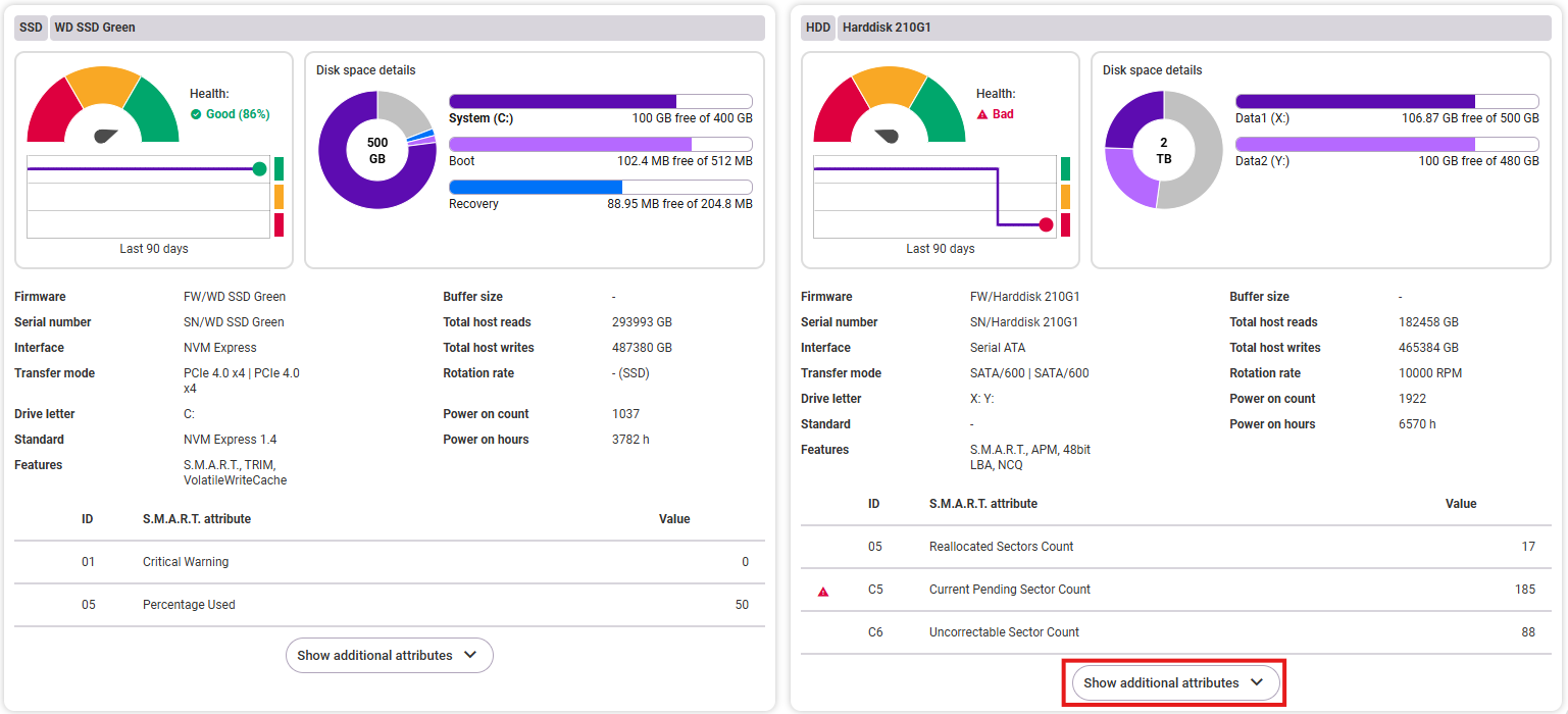
- Name: Hard drive type and model name
- Hard drive status: You will see a display showing the current status of the hard drive (good, caution, bad). Below this, a diagram shows the history of the hard drive status over the last 90 days. For NVME hard drives, the condition is also shown as a percentage.
- Disk space details: Here you will see an overview of the distribution of disk space on the hard drive (pie chart) and, next to it, all available partitions with details of their available disk space.
- Hard drive details: The following information is available:
- Firmware
- Serial number
- Interface
- Transfer mode
- Drive letter(s)
- Standard
- Features (e.g., S.M.A.R.T., TRIM, etc.)
- Buffer size
- Total amount of host reads
- Total amount of host writes
- Rotation rate (HDD only)
- Power on count
- Power on hours
- S.M.A.R.T. attributes: The table shows relevant data for evaluating the condition of the hard disk. Abnormal values are marked with an exclamation mark:
The attributes are sorted by importance and are dependend on the hard disk manufacturer. You can use a button below the table to show additional attributes or collapse the table from its expanded state. - ID (of the attribute)
- S.M.A.R.T. attribute (name or title)
- Value (of the attribute)