Dashboard
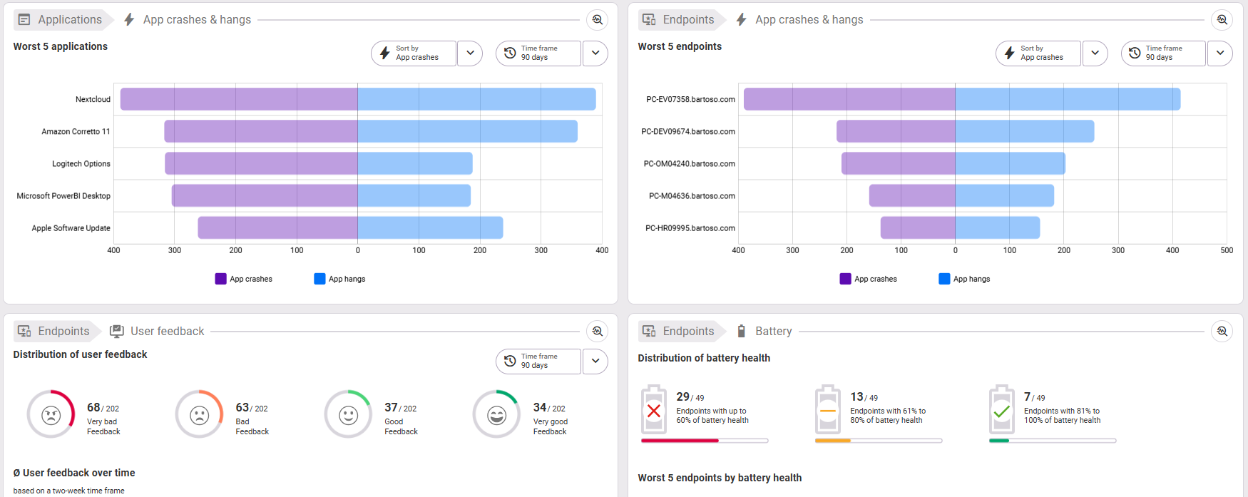
All selectable areas are displayed by default. The dashboard can be customized to suit your needs. We explain how to select tiles in the Customize dashboard section.
Time frame: The time frame adapts to the time period you last selected in the Application or Endpoints sections. It can also be selected individually in each of the available overviews in the top right corner.
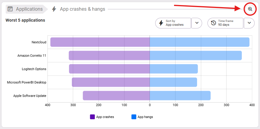
Opening the details: If you want to see the details of an overview, click on the magnifying glass icon in the top right corner of a card, which stands for “Investigate”. Note: It is not possible to open the endpoint details directly from the bars or rows in the chart or table with a single click. This only works in the respective views of applications or endpoints.
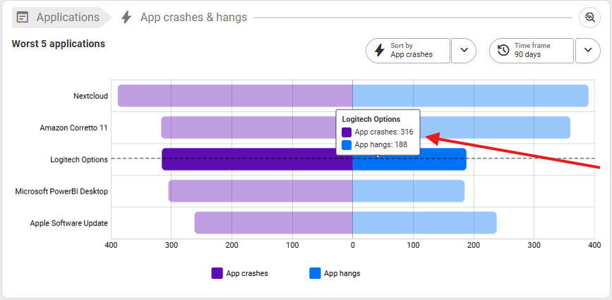
Tooltip: When you hover the mouse over the graphics, you will see the detailed information about the selected values in the tooltip as usual.
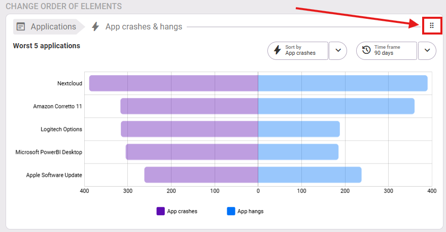
Sorting: If a “Sort by” drop-down field is available directly above the diagram, you can reorder the display of the results according to the selection options.
Customize dashboard
At the top right, you can customize the dashboard according to your needs, select or deselect overviews, and change their order on the dashboard.

Select the category you want and select or deselect the elements you want from the carousel by checking or unchecking the blue boxes:

You can change the order of the elements by clicking on the tiles in the lower area with the left mouse button, holding the click and then dragging them to the desired position:
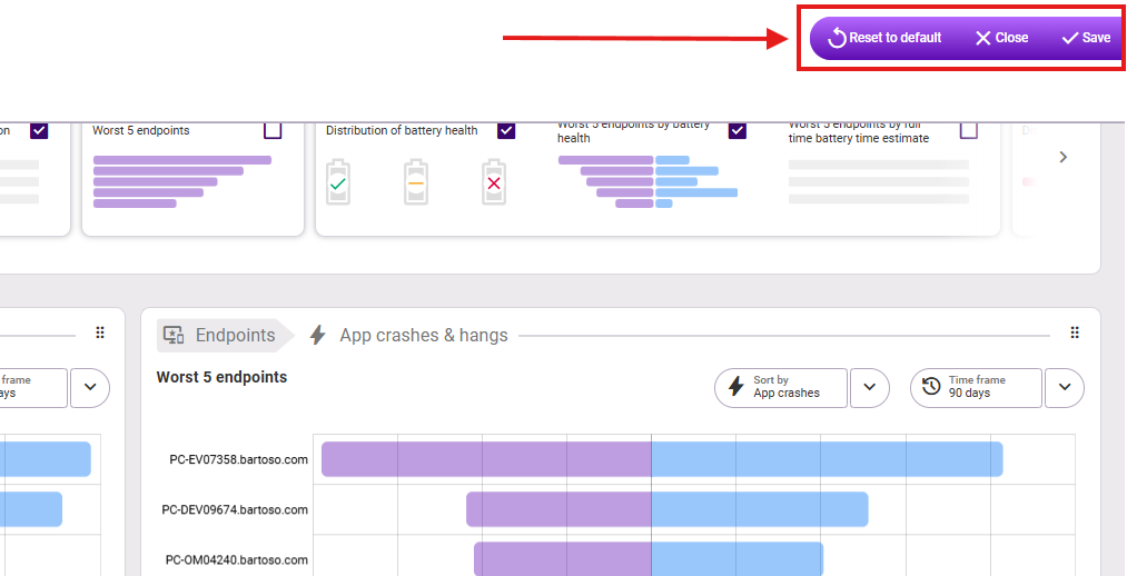
Before you leave the Customize dashboard area, select whether you want to save and close, reset the changes, or close (without saving) in the upper right corner: