Stability
To do this, first select your active environment at the top right. All environments you have access to are available.
The magnifying glass icon at the top provides a global search function.
Environment Stability Score
The Environment Stability Score shows the average stability of the selected environment. The time period is the same as selected in the Measurement section.
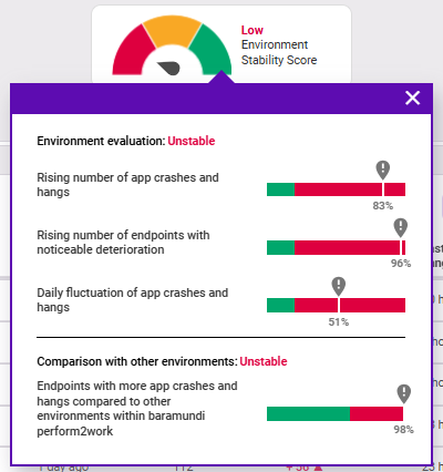
The calculation of the value is composed of the following four indicators:
- Increase in app crashes and hangs: The value indicates by what percentage the crashes and hangs have increased compared to the previous period. If the value is more than 20 % above the previous period, the indicator is in the red zone.
- Increase in endpoints with noticeable degradation: The value indicates the number of endpoints that have an increase in app crashes and hangs of more than 20 % from the previous period. If this value is above 20 %, the indicator is in the red zone.
- Daily variation of app crashes and hangs: This value is calculated using the average number of events per day. If this value is above 20 %, the indicator is in the red zone.
- Endpoints with more app crashes and hangs compared to other baramundi Proactive Hub environments: This value gives the mean (more precisely, the median) of events per day from all endpoints across baramundi Proactive Hub. This value serves as a comparison value: if more than 60 % of the endpoints in the environment are above this daily mean value here, the indicator is in the red zone.
There are three levels:
- High: All indicators are in the green zone.
- Medium: Exactly one indicator is in the red range.
- Low: Two or more indicators are in the red range.
Environment rating:
- Stable: The selected environment is rated as stable if all of the above indicators are in the green range.
- Unstable: The selected environment is rated as unstable if one or more of the above indicators are in the red range.
Note: In case there is still too little data available in your environment, you will see the yellow note (see figure below). The Environment Stability Score can only be calculated as soon as data of at least twice the period is available than the period you have chosen (example: for the score of 30 days, the data of the last 60 days is required). The minimum period of necessary data to calculate the score is two weeks.
Measurement
In the Measurement section, you can see all the endpoints of your selected environment listed in the selected period, by default sorted by name of the endpoint. Here you'll find an explanation of the table functions.
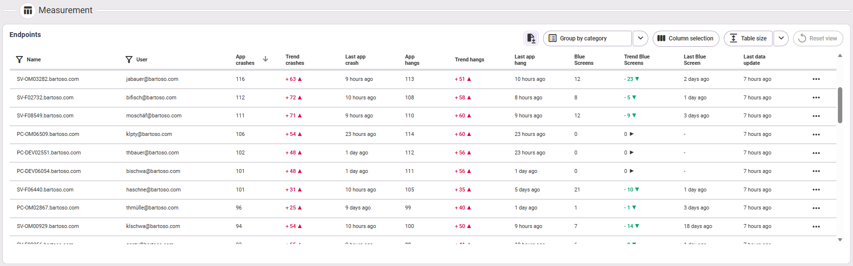
The following information is available:
- Name (of the endpoint)
- User: name of the user (of the endpoint)
- App crashes: number of app crashes on the endpoint
- Trend crashes: the change compared to the past period
- Last app crash: time of the last app crash
- App hangs: number of app hangs on the device
- Trend hangs: the change compared to the past period
- Last app hang: time of the last app hang
- Blue Screens: number of blue screens on the device
- Trend Blue Screens: the change compared to the past period
- Last Blue Screen: time of the last blue screen
- Last data update (the values are transmitted by the agent and may differ depending on the area)
- Analysis
In the analysis area, you can select the following areas in the tabs on the left:
- App crashes
- App hangs
- Blue Screens
Overview graphics
In each of the three selectable areas, you will first see a summary for the selected event (app crashes/app hangs/blue screens) at the very top:

- How many endpoints are affected by all of them in the selected environment?
- How many events were there in total and what is the trend (small number)?
- How many events were there on average per endpoint? App hangs/crashes are also displayed: How does this compare with the global average of all endpoints listed in baramundi Proactive Hub (trend in the small number)?
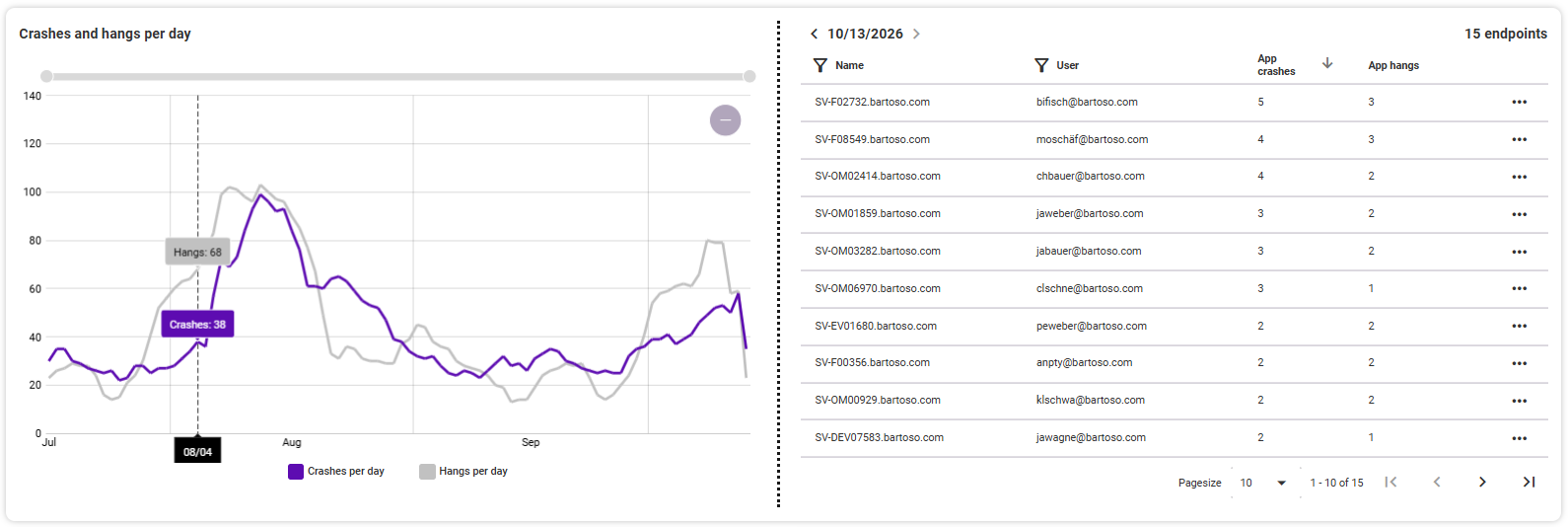
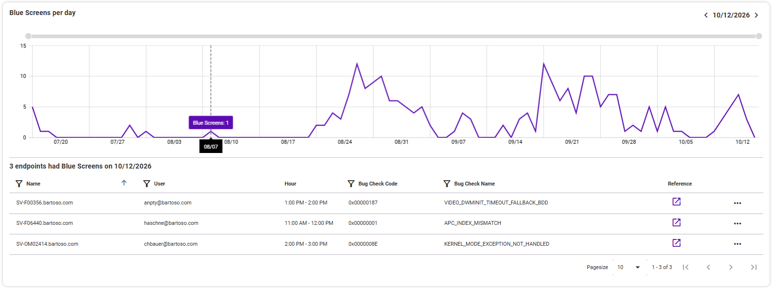
The overview [event] per day follows below this. By clicking on a point in time in the graphic, you can see the endpoints affected on that day with their users and the number of events that occurred in the associated table. Click on one of the endpoints or use the three-dot menu on the right to open it in the detailed view.
Blue Screens: In the list of endpoints with blue screens per day, you will see additional information on the time, error code, error name and find an (external) link to the corresponding reference.
Note on time window:
If there is a selection menu for the time period in the top right-hand corner of a graphic, you can set it separately for this graphic. Otherwise, the time period selected in the Measurement area is used. The time span within a graph can be changed by using the mouse wheel (zoom in/out) or the zoom bars at the top and right.
Crashes and hangs
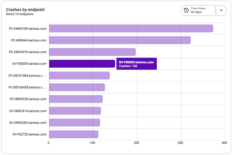
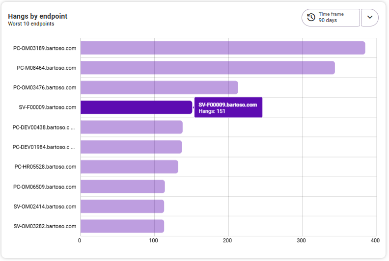
Crashes/hangs by endpoint
The left-hand graph shows you the flop 10 crashes/hangs per endpoint. The vertical axis shows the names of the affected endpoints, the horizontal axis the number of crashes/hangs. Clicking on an endpoint opens the detail view for this endpoint.
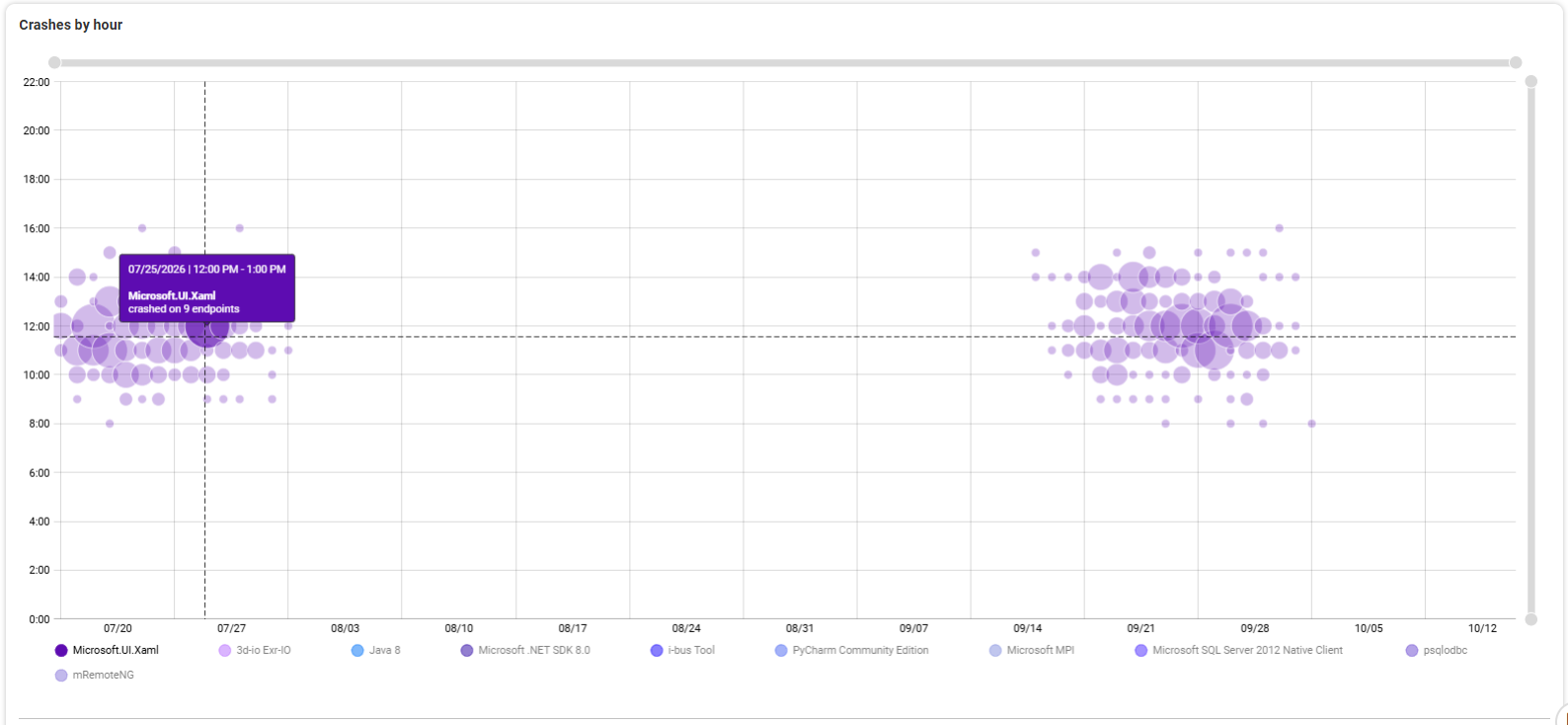
Crashes/hangs by hour
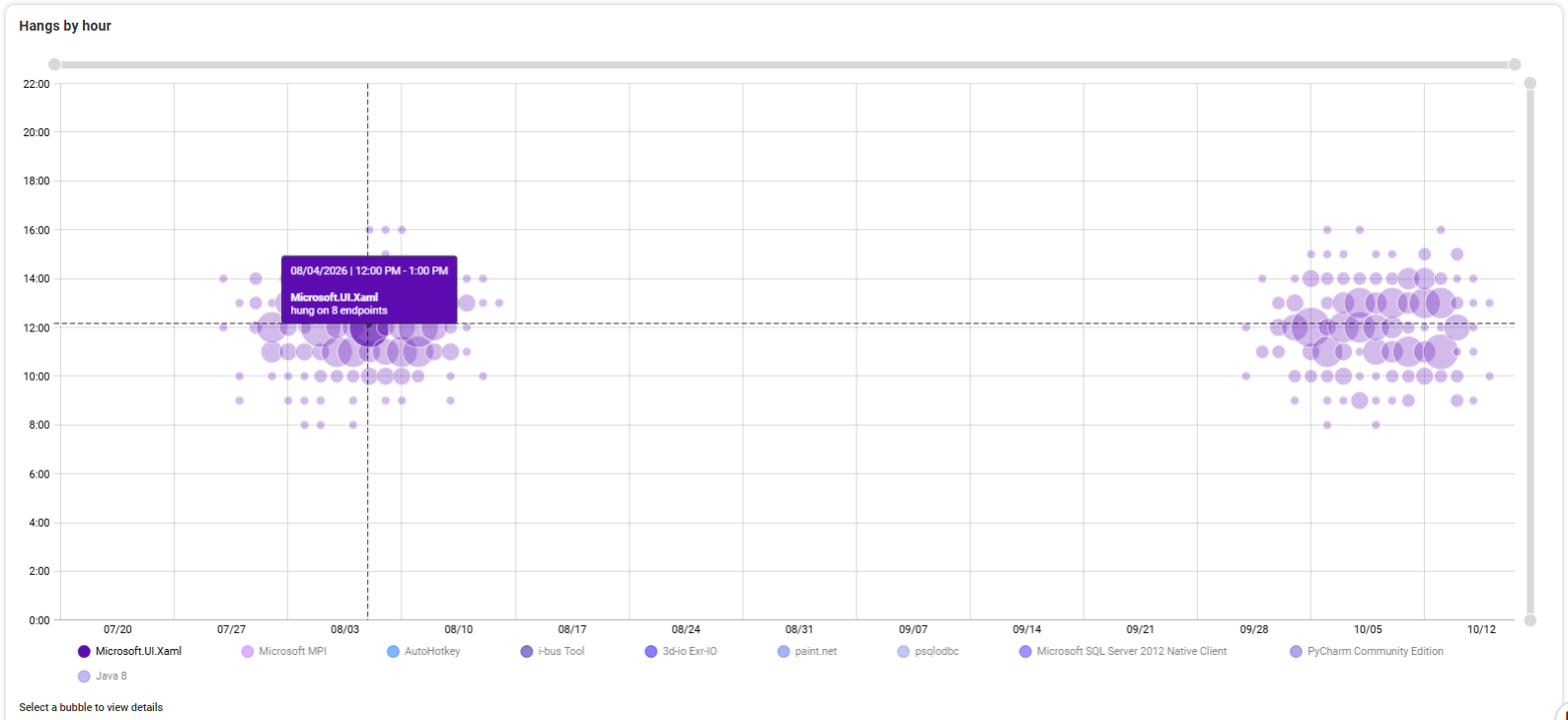
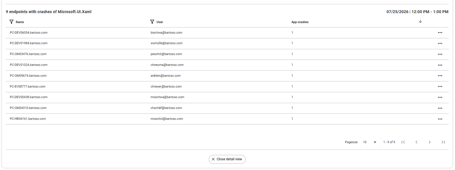
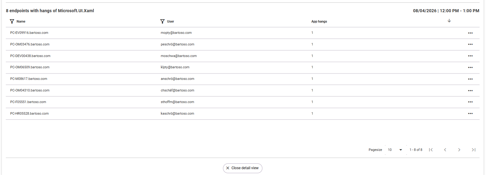
The chart on the right shows the top 10 crashes/hangs per app and per hour. The vertical axis shows the time in hours, the horizontal axis the selected time period. Below the graph, select an app whose data you want to see. The app with the most crashes/hangs is selected by default. The individual circles each represent an incident at the same time. Depending on how many endpoints were affected by this incident, the circle is larger or smaller. If you move the mouse over a circle, you will see details. Clicking on a circle opens a list of the affected endpoints below the app list. Clicking on an endpoint opens the detail view for this endpoint.
Criticality of specific crashes
This diagram shows the ten most frequently occurring error codes (y-axis), based on the selected time period on the right. The app crashes, the affected endpoints and the affected applications are displayed. This gives you a quick overview of which error code leads to the most frequent app crashes and how many devices and applications were affected. In addition to setting the time period, you can sort by app crashes (default), affected endpoints and affected applications in the diagram. The most frequently occurring number is always at the top. The x-axis is divided into two: The app crashes are shown on the left, the affected endpoints and applications on the right.
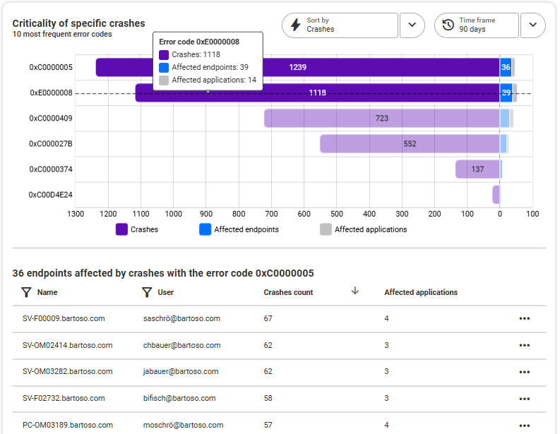
In the list below the diagram, you see the affected endpoints related to the error code selected above (line in the diagram). At a glance, you can see the user assigned to the device, the number of app crashes on this device, and the number of affected applications. The table columns can be sorted in ascending or descending order; the free-text filter is available for the Name and User columns. To view the details for a device, click on the corresponding row or open it using the three dots on the right. On the device details page, the Measurement area is then already pre-filtered according to the selected error code.
Blue Screens
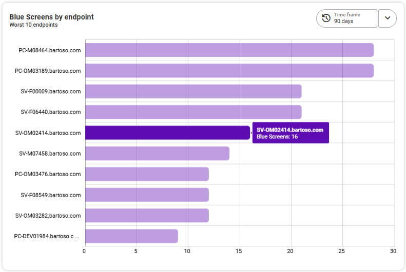
Blue Screens by endpoint
This graphic shows you the flop 10 bluescreens per endpoint. The vertical axis shows the names of the affected endpoints, the horizontal axis the number of blue screens. Clicking on an endpoint opens the detail view for this endpoint.
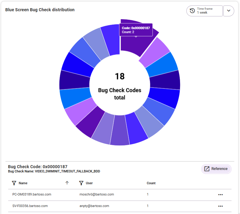
Blue Screen Bug Check distribution
Here you can see an overview of how many different bug check codes have occurred in the selected time period. By selecting one of the codes, you can see the affected endpoints in a list below the graphic. You will also receive a direct (external) link to the corresponding reference and you can see how often this error code occurred at the respective endpoint in the selected time period. Clicking on an endpoint (alternatively via the three-dot menu on the right) opens it in the detail view.