
Connectivity
Overview
The overview tiles show you information about the following at a glance:

- Average WiFi strength: shows the distribution of the WiFi signal strength of the endpoint and the environmental average in percent; Tooltip: Hover your mouse over the individual areas to see their percentage and over the legend areas to see their distribution: Strong: 100-81%, Good: 80-51%, Bad: 50-26%, Unusable: 25-0%.
- Network usage: shows the distribution of the endpoint across all connection types (Ethernet, WiFi, Mobile) as a percentage and broken down into with and without VPN usage; Tooltip: The tooltip shows you the total percentage for each bar and the distribution between use with and without VPN.
The following three tiles summarize the performance and efficiency of the network types of this endpoint from the Analysis > Capability area: Ethernet, WiFi, Mobile. All values are compared (gray bars/values) with the corresponding average value of all endpoints in the selected environment. The small numbers (red/green) show you the trend by which the value has changed over the past period. The time frame is the same as the one you select in the Measurement section. You can also see this information in the tooltip. The following values are displayed:
- Latency: indicates the time it takes for a TCP packet to be sent to a server and back (usually referred to as round-trip time (RTT)); Example: If it takes 2 ms to reach the server and 3 ms to return to the endpoint, the latency is 5 ms.
- Jitter: indicates the time period within which the latency fluctuates during data transmission; Example: If the average latency is 230 ms and the jitter is 45 ms, the latency fluctuated between 185 ms and 275 ms. A high jitter value can lead to packet loss.
- Packet loss: Indicates the percentage of packets lost during network connections, i.e., packets that do not reach their destination. Example: If 100 packets are sent and 3 of them do not reach their destination, the packet loss is 3%.
Measurement
In the Measurement section, you will find a detailed overview of the network information of the (virtual) network adapters of the endpoint and its last connections. Select the desired time frame in the upper right corner. The last connection used is always the first one and is highlighted in color. In addition to the details, you will see an automatically generated graph that visualizes the connection history. All other network connections appear in gray. If more connections were found than are visible, a button labeled Show all adapters appears below. Click on this button to see the remaining adapters.
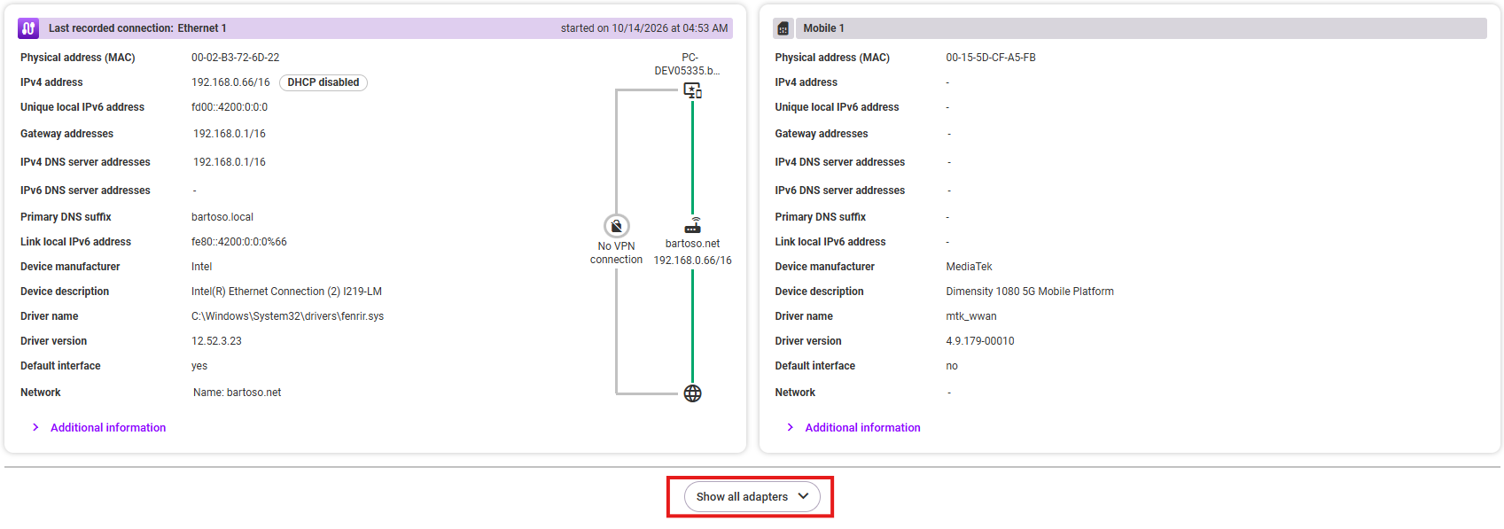
Depending on the network type (WiFi, Ethernet, or Mobile), you will see the corresponding information:
- Physical address (MAC)
- IPv4 address
- Unique local IPv6 address
- Gateway addresses
- IPv4 DNS server addresses
- IPv6 DNS server addresses
- Primary DNS suffix
- Link local IPv6 address
- SSID 1)
- WiFi standard 1)
- Max. WiFi standard 1)
- Frequency band 1)
- Network channel 1)
- Security type 1)
- Device manufacturer
- Device description
- Driver name
- Driver version
- Default interface
- Network
1) WiFi only
Additional information:
- Operational status
- Connection is metered
- Data limit
- Over data limit
- Data limit reset date
- Max. receive / transmit speed
- APIPA (Automatic Private IP Addressing)
Analysis
In the analysis area, you can choose between the Connection and Capability areas on the left.
Connection
The Connection section shows all network connections and connection losses over time. You can set the time frame in the top right corner. You can also change the visible time frame by zooming with the mouse wheel or using the scroll bar at the top. If you hover your mouse over the graphic, you will see detailed information about each area at the selected time in the tooltip.
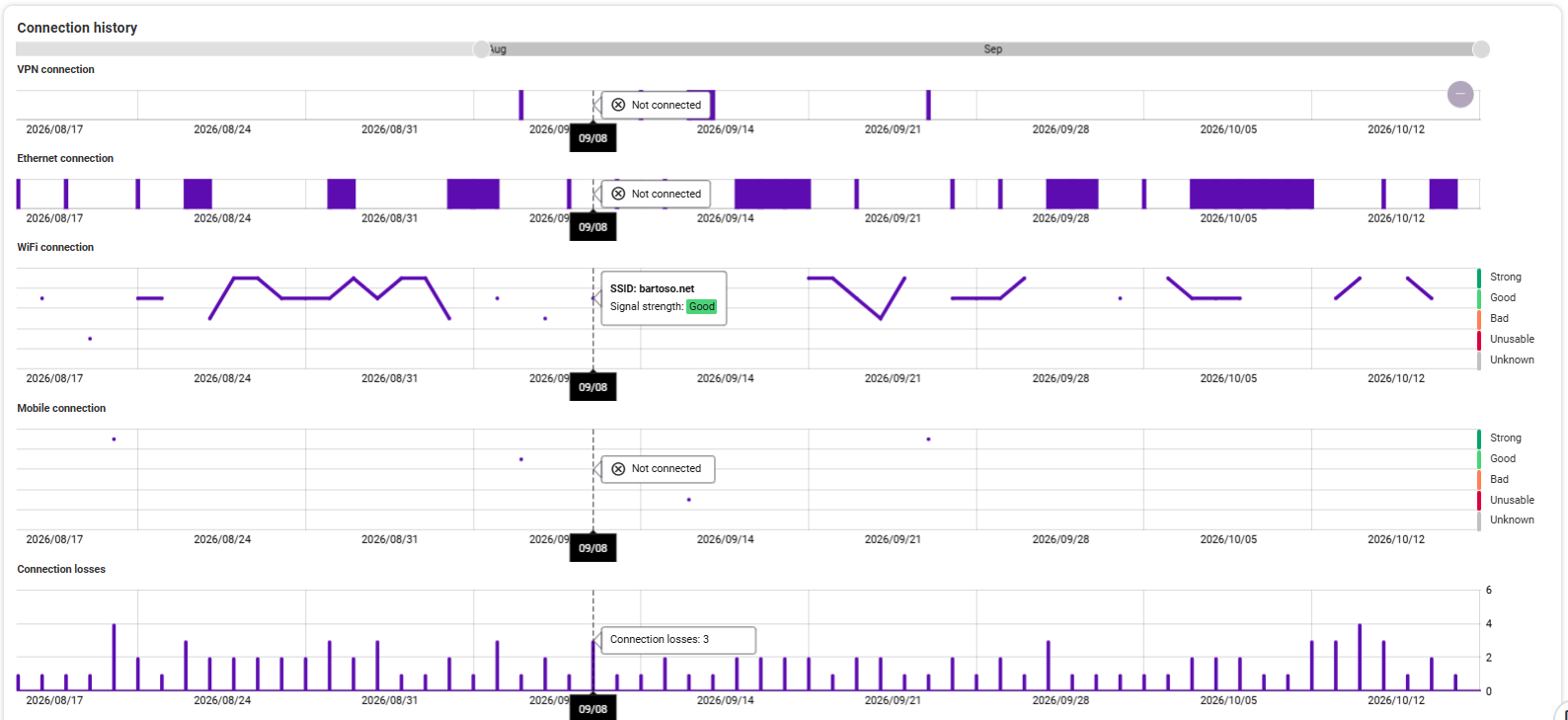
The following areas are displayed:
- VPN connection: Indicates whether and when a VPN connection existed and, if so, which one.
- Ethernet connection: Indicates whether and when an Ethernet connection existed and to which network.
- WiFi connection: Indicates whether and when a WiFi connection was established, with what signal strength (strong, good, bad, or unusable), and the SSID of the network.
- Mobile connection: Shows whether and when a mobile connection was established, with what signal strength (strong, good, bad, or unusable), and the name of the network.
- Connection losses: Shows at what time there were how many connection losses.
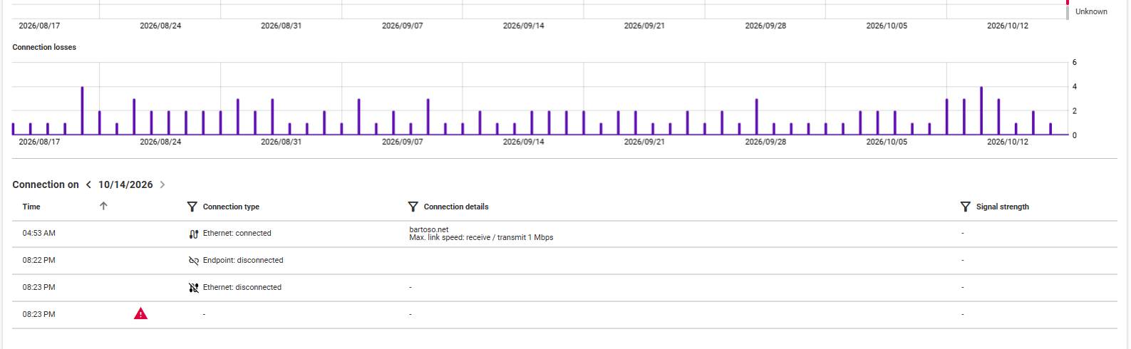
Clicking on a time in the history graph opens a table below that provides information about all connections on that day. The table provides the following values:
- Time at which the connection was established or disconnected
- Connection type: Network and whether the connection was established or disconnected
- Connection details: Name of the network/VPN, maximum link speed
- Signal strength: strong, good, bad, unusable, no information (-)
The table can be sorted by each column, and columns with a filter icon can also be filtered according to your specifications. Practical: Use the arrows to the right and left of the date in the table header to switch between the available days. This means you don't have to select each date in the chart above by clicking on it.
There are two additional detailed graphics below the connection history:
WiFi connections
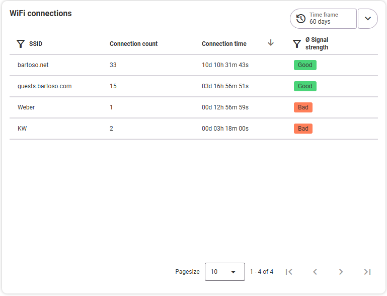
This table lists all WiFi connections in the selected time frame and by SSID. The default sorting is by the Connection time column. Here you can quickly see which SSID had the most connections, how long the total connection time to the respective network was, and how good or bad the average signal strength was. Select the time frame directly from the list at the top right. Available columns:
- SSID (of the network)
- Connection count
- Connection time (total over the time frame)
- Average signal strength over the time frame: strong, good, poor, unusable, no information (-)
The table can be sorted by each column, and columns with a filter icon can also be filtered according to your specifications.
WiFi connection time distribution
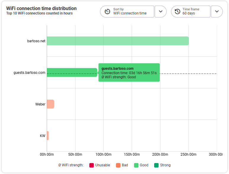
In addition to the WiFi connections table, this graph shows you how the connection duration to the WiFi networks at the endpoint was distributed over the selected time frame and what the average connection strength was. It always shows the top 10 WiFi connections by number of hours of use. By hovering your mouse over one of the bars, you will see information in the tooltip about the SSID of the WiFi network, the total connection duration in days, hours, minutes, seconds, and the average signal strength (strong, good, poor, unusable).
- y-axis: network SSID
- x-axis: total usage time in hours and minutes
You can select the time frame directly in the graph at the top right. To the left, you can sort by WiFi connection time or WiFi strength.
Capability
In the Capability section, you will see an overview tile at the top with a summary of the most important values from Ethernet, WiFi, and Mobile communications. The quality criteria for the connection are: latency, jitter, and packet loss. You can set the time frame for this section at the top right of the analysis area.
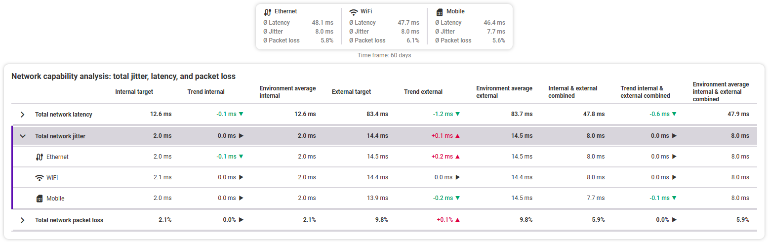
Network capability analysis: total jitter, latency, and packet loss
The table below lists all details for the criteria (latency, jitter, packet loss) broken down by network connection (Ethernet, WiFi, Mobile) and the average total values for each criterion. Explanations of latency, jitter, and packet loss can be found above. The rows are collapsed by default to show the total values and can be expanded to view the detailed information. The following values are displayed here:
- Internal target (a target in the same network as the endpoint): Indicates the total value if it is an internal target
- Internal trend: Indicates in milliseconds or percent whether the value has deteriorated (red) or improved (green); the comparison is made with the same time period as the selected time frame, i.e., if a period of two weeks is selected, the comparison is made with the previous two weeks.
- Internal environment average (values of all packets in the same network as the endpoint): The value is used for comparison with the environment average, i.e., the internal value of all endpoints in the environment.
- External target (a target outside the endpoint's network): Specifies the total value if it is an external target.
- External trend: Specifies in milliseconds or percent whether the value has deteriorated (red) or improved (green); Compared with the same time period as the selected time frame, i.e., if a period of two weeks is selected, the comparison is made with the previous two weeks.
- External environment average (values of all packets outside the endpoint's network): The value is used for comparison with the environment average, i.e., the external value of all endpoints in the environment.
- Internal & external combined: The weighted average of all internal and external values of the endpoint
- Trend internal & external combined: Indicates in milliseconds or percent whether the value has deteriorated (red) or improved (green); the comparison is made with the same time period as the selected time frame, i.e., if a period of two weeks is selected, the comparison is made with the previous two weeks.
- Environment average internal & external combined: The weighted average of all internal and external values of all endpoints in the selected environment.
Progression of the criteria latency, jitter, and packet loss over time
- Average latency over time
- Average jitter over time
- Average packet loss over time
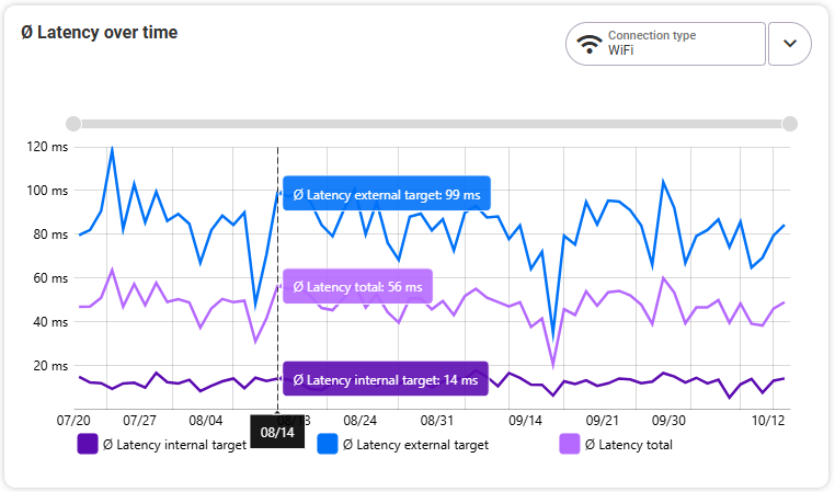
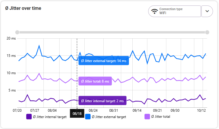
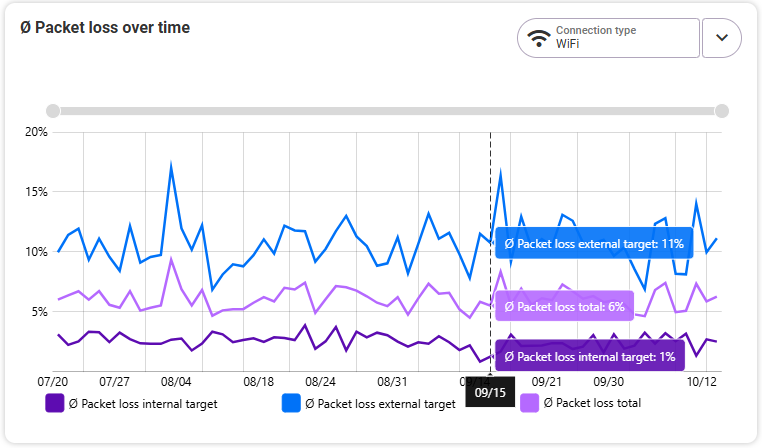
Each of these graphs shows you the progression of values over time depending on the connection type and time frame selected in the graph. The last 90 days are displayed by default. Change this time frame by scrolling over the graph with the mouse wheel or using the scroll bar at the top of the graph. You can choose between three connection types (Ethernet, WiFi, Mobile) in a drop-down menu at the top right of each graph. Select the connection type you want to examine in more detail. The graph then shows you three trends: the average trend for internal targets, the average trend for external targets, and the trend for the total average value. Hover your mouse over the graph to see detailed information about the average values for each day.