
Performance
First select your active environment in the top right-hand corner. All environments to which you have access are available to you.
Using the magnifying glass icon at the top, you can use a global search function for Username, Application or Endpoint.
Overview
At the top, you see a summary of the data (total installations, average boot impact, average CPU and RAM utilization) for the endpoint in the selected time period. You select the time period at the top right in the Measurement area.

- Total number of installations within the selected environment
- Average boot impact of the application
- Average CPU utilization of the application in percent (small number shows trend compared to the chosen timeframe before) in comparison with the average of all applications recorded in the same environment
- Average RAM utilization of the application in percent (small number shows trend compared to the chosen timeframe before) in comparison with the average of all applications recorded in the same environment
Measurement
In the Measurement section, you will see all endpoints of the environment you have selected on which the chosen application is installed, sorted by default according to the device name. Here you'll find an explanation of the table functions.
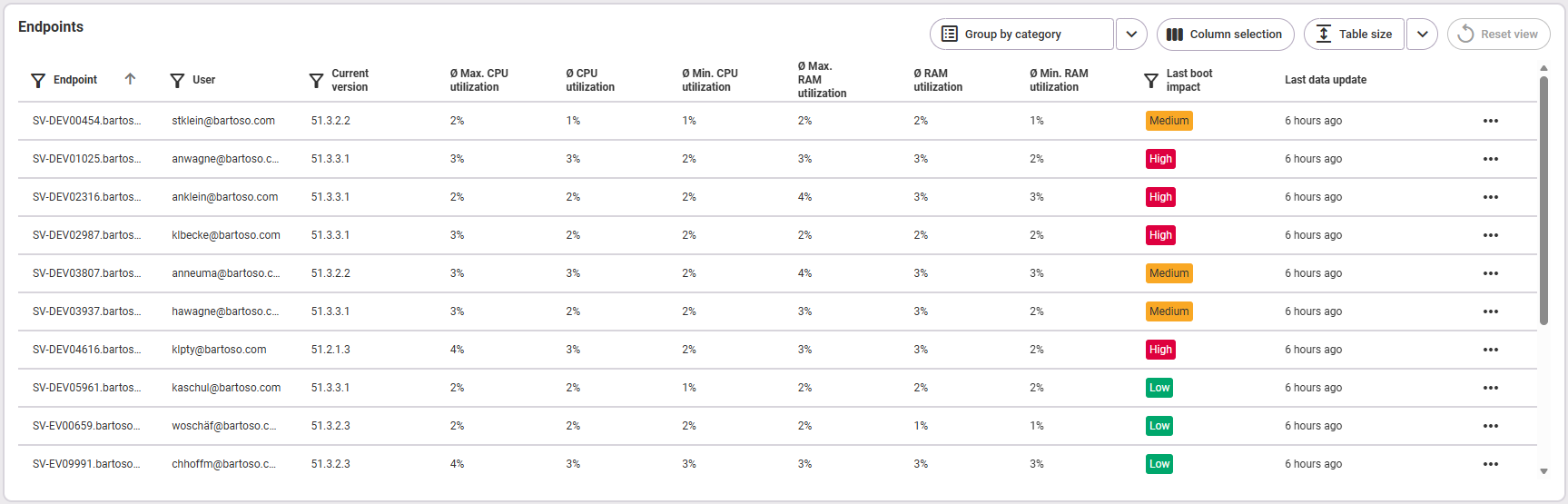
The following information is available:
- Name of the endpoint
- User of the endpoint
- Current version of the application, installed on this endpoint
- Average maximum CPU utilization (the average of all maximum CPU utilization values in the selected time frame)
- Average CPU utilization
- Average minimum CPU utilization (the average of all minimum CPU utilization values in the selected time period)
- Average maximum RAM utilization (the average of all maximum RAM utilization values in the selected time period)
- Average RAM utilization
- Average minimum RAM utilization (the average of all minimum RAM utilization values in the selected time period)
- Last boot impact (more information on this can be found below in the section Analysis > Boot impact)
- Last data update
Analysis
Boot impact
Overview tile
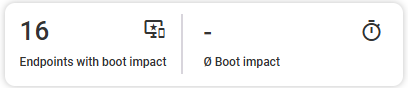
The overview shows you:
- How many endpoints were affected by the boot impact of this application in the selected time period?
- What was the average boot impact of this application in the selected time period?
{Name of application}: Boot impact distribution
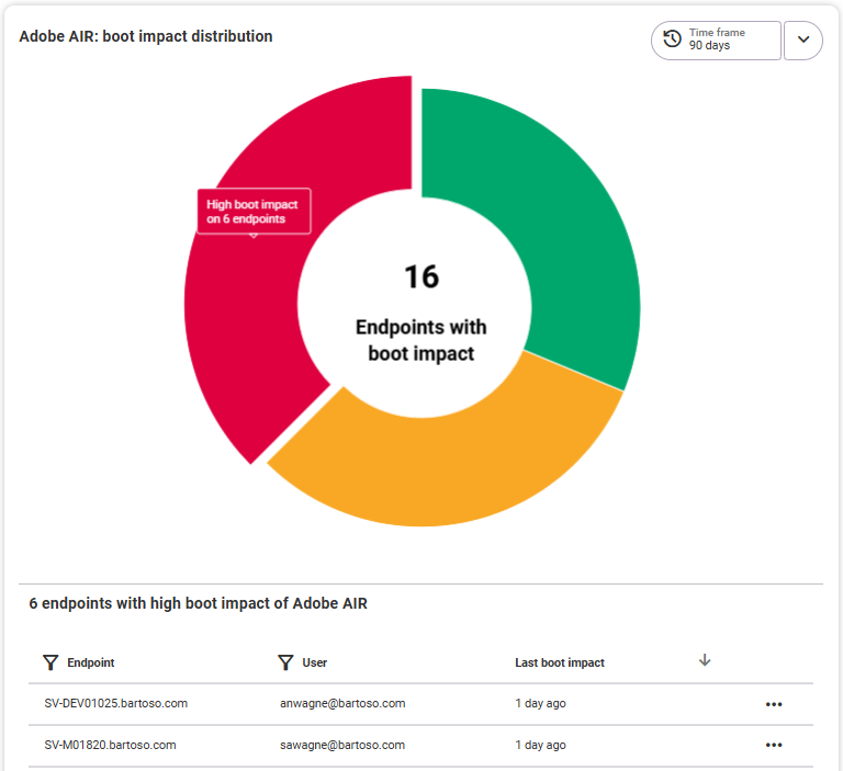
The diagram shows you at a glance how the boot impact of this application was distributed across all endpoints on which it is or was installed during the selected time period. To see which endpoints are affected, select an impact in the diagram (high, medium or low). A list with the corresponding endpoints and their details (endpoint name, user and the time of the last boot impact) appears below the diagram. Click on the endpoint or use the three-dot menu on the right-hand side to open the endpoint in its detailed view.
CPU
Overview tile
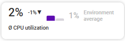
The overview tile shows the average CPU utilization of the application in percent (small number shows trend compared to the chosen time frame before) in comparison with the average of all the same applications recorded in the environment.
{Application name}: CPU utilization by endpoint
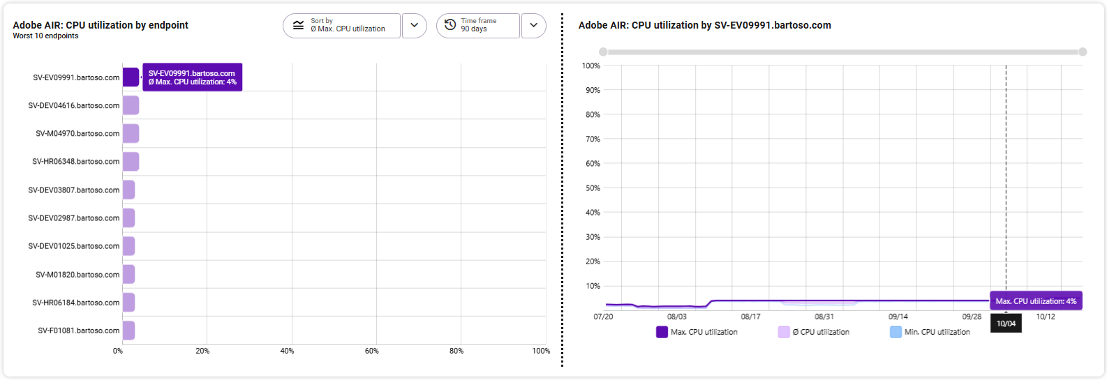
The diagram «Worst 10 endpoints» lists the ten endpoints that had the highest/worst values over the selected period from the three selectable areas in the sorting. The following areas can be selected:
- Maximum CPU utilization
- Average CPU utilization
- Minimum CPU utilization
Independent of the sorting, the highest value is always at the top. The x-axis shows the CPU utilization value. Select the desired time period over which the values are to be displayed in the top right-hand corner. By default, the time period of the Measurement area is used.
On the right-hand side, you can see the details of the endpoint selected on the left in an extra chart. The area selected on the left (max./min./average CPU load) is highlighted in color on the right and shows the corresponding CPU load of this application over the course of the selected time period. The two areas not selected are also available for comparison in a more subtle color. Change the selected time frame by zooming into the graphic with the mouse wheel or using the gray zoom bar at the top edge.
Detailed view in the tooltip: By hovering with the mouse over individual points in the graphic, you can see the respective value for the selected area at this time in the tooltip.
RAM
Overview tile
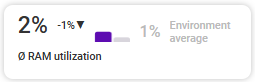
The overview tile shows the average RAM utilization of the application in percent (small number shows trend compared to the chosen time frame before) in comparison with the average of all the applications recorded in the environment.
{application name}: RAM utilization by endpoint
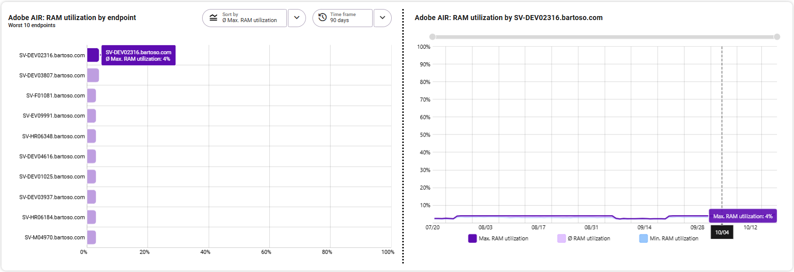
The diagram «Worst 10 Endpoints» lists the ten endpoints that had the highest/worst values over the selected period from the three selectable areas in the sorting. The following ranges can be selected:
- Maximum RAM utilization
- Average RAM utilization
- Minimum RAM utilization
Independent of the sorting, the highest value is always at the top. The x-axis shows the RAM utilization value. Select the desired time period over which the values are to be displayed in the top right-hand corner. By default, the time period of the Measurement area is used.
On the right-hand side, you can see the details of the endpoint selected on the left in an extra graphic. The area selected on the left (max./min./average RAM usage) is highlighted in color on the right and shows the corresponding RAM usage of this application over the selected time period. The two areas not selected are also available for comparison in a more subtle color. Change the selected time frame by zooming into the graphic with the mouse wheel or using the gray zoom bar at the top edge.
Detailed view in the tooltip: By hovering with the mouse over individual points in the graphic, you can see the respective value for the selected area at this point in time in the tooltip.